Some explicit data is not displayed due to NDA restrictions.
Optimizing Visual Design Hierarchy to Boost Donations
Enhancing design clarity, especially in information hierarchy, to help users better understand and proceed to the donation stage
Introduction
Amalsholeh.com is an online fundraising platform managed by PT Amal Sholeh Indonesia to collect donations for Infak, Sedekah, and Wakaf through various programs. Dedicated to being a platform that ensures every donation you make reaches those who truly need it.
Timeline
November 2020
My Role
UX Designer
Team
1 Product Designer, 1 Front-End Developer, 1 Back-End Developer, 1 Stakeholder
Current Problem
More than 50% of visitors decide not to proceed with the donation process.
Based on data from our analytics tool, as of October 2020, the visitor-to-donor ratio is as follows:
- Average visitors: ~15,000
- Proceeding to checkout: ~2,000
Based on the data above, the current conversion rate is around 13%. We aim to improve this rate by increasing the number of users proceeding to checkout by 20%.

Time to Discover The Issue
Before creating a solution, I need additional data from users. I collaborated with the customer service team at Amalsholeh to gather the necessary data, especially when users decided not to proceed with their donations. The most common reasons, based on recurring themes, are:
- Don't know how to donate
- Confused when filling out the donation form
- Decide not to donate because the collected donation information is either too little or too much
From the data above, the key pain points are clear. However, I discussed them with the relevant team, as the required efforts may vary, and the impact on the business also needs to be considered.
Given the time constraints and our goal to deliver the improvements quickly to users, I facilitated a brainstorming session with the team using the Impact-Effort Matrix method for prioritization (source: prioritization-methods).
We gathered many insights and solutions, but here are some of the most relevant ideas that directly address the identified problems.
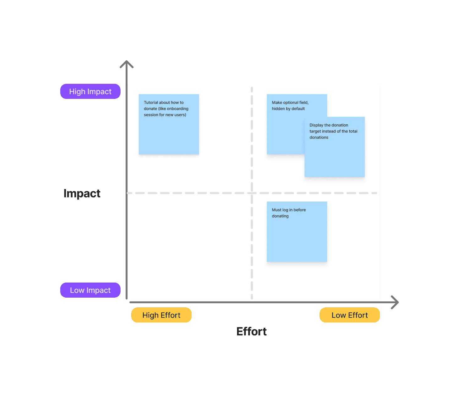
After discussing with the team, we decided to focus on improving the program detail page and the checkout process.
Key Improvement
- Display the donation target instead of the total donations, as some users hesitate to donate when they see either too little or too much has already been collected.
- Simplify the checkout process, especially for users who are not logged in—only showing the name and phone number fields by default, while the rest remain hidden as optional.

Let's Audit the UX
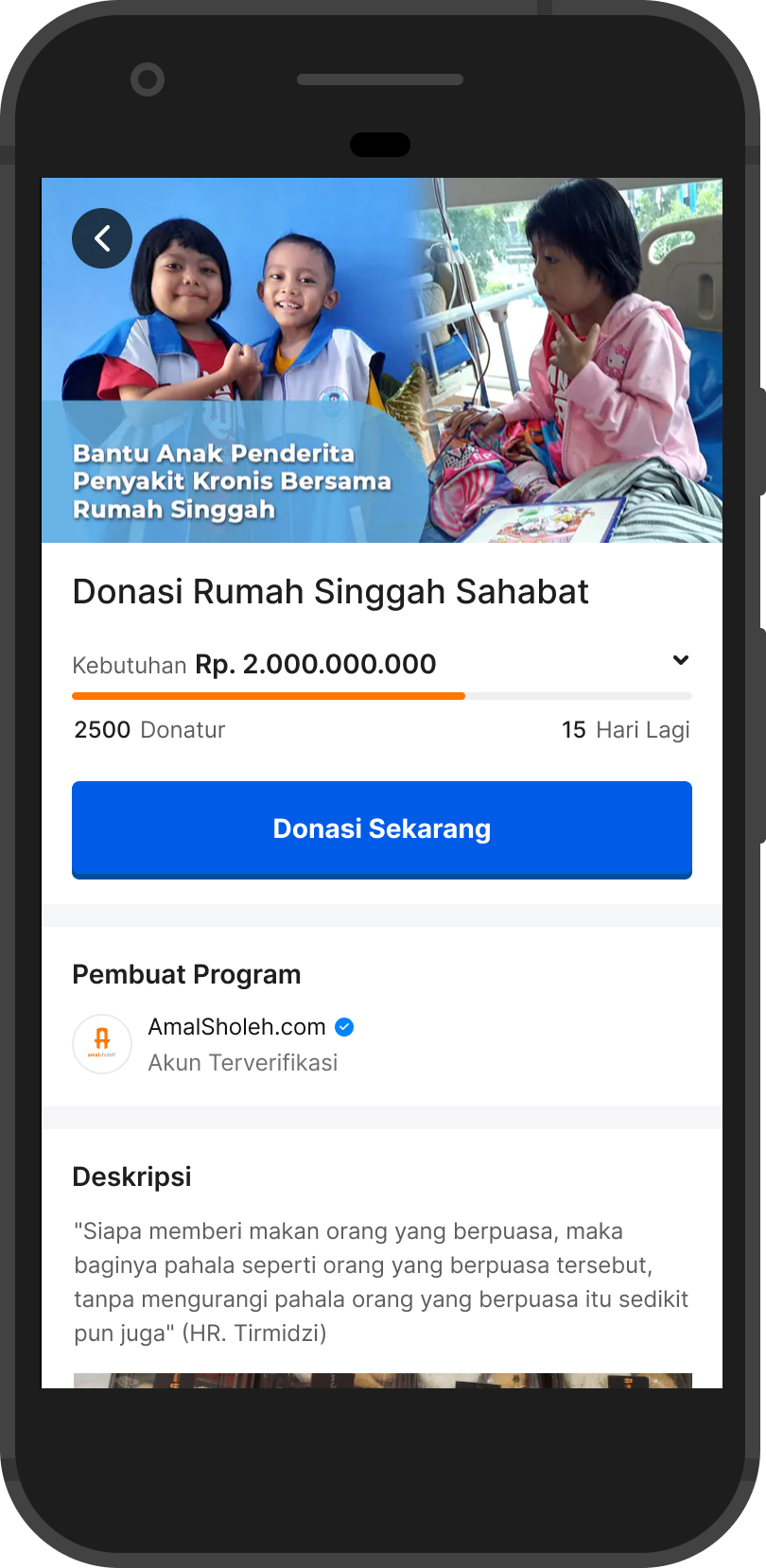
Detail Program Page
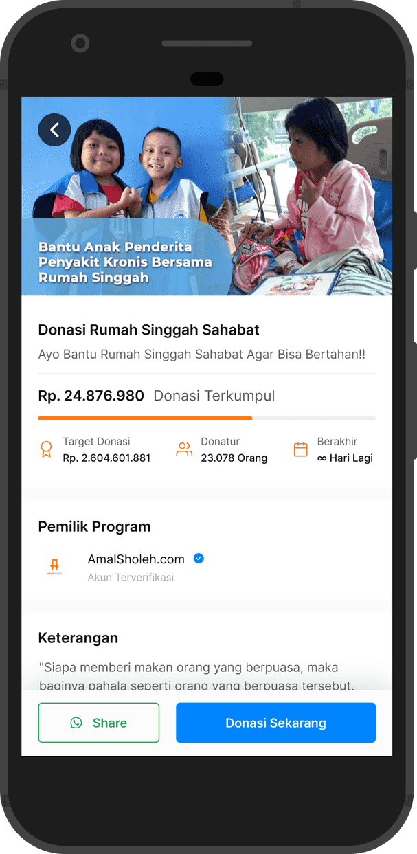
Previously, each program title had a subheadline, followed by donation progress information and other details. The CTA button for donating was positioned at the bottom of the viewport, along with a share button.
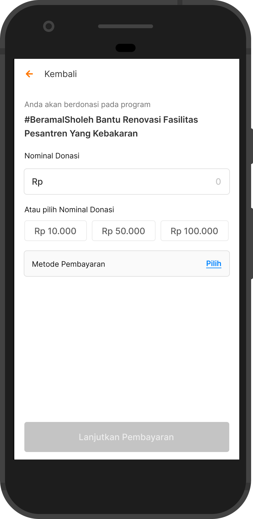
Checkout Page
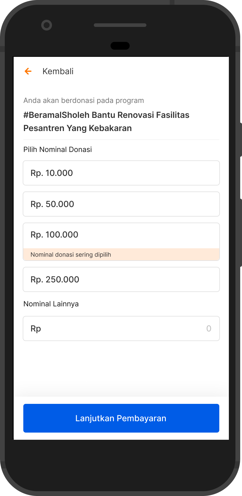
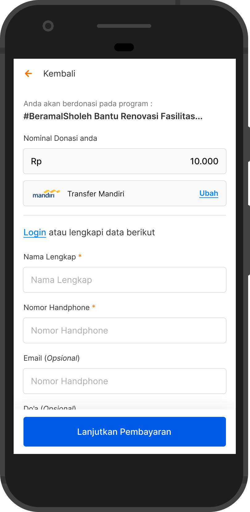
When entering the checkout page, users are required to either select a available donation amount or input their desired amount manually. They are then directed to a payment selection page, where they choose a destination bank and fill in the required personal details, such as full name, phone number, email, and a prayer message.

Design Proposal
Detail Program Page
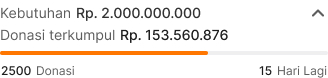
In the latest design, I decided to remove the subheadline. Why? To ensure users focus on the program title and donation target amount.
But can users still see the total donations collected? Absolutely. Transparency is essential for both the program owner and Amalsholeh. The total donations will remain accessible—users can tap on the donation target section, which is marked with an arrow icon, indicating additional information inside.
Call-to-Action (CTA) Improvements:
- Now positioned closer to the main program information for better visibility.
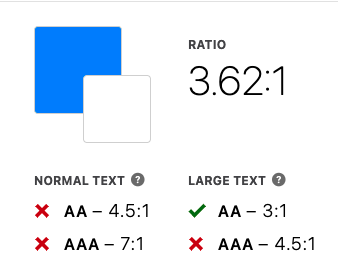
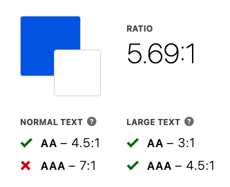
- Size and color adjusted to meet WCAG accessibility standards, ensuring clarity, especially for users over 40 years old.
- Sticky behavior: When scrolling, the CTA moves to the bottom of the screen to remain accessible without obstructing important content.
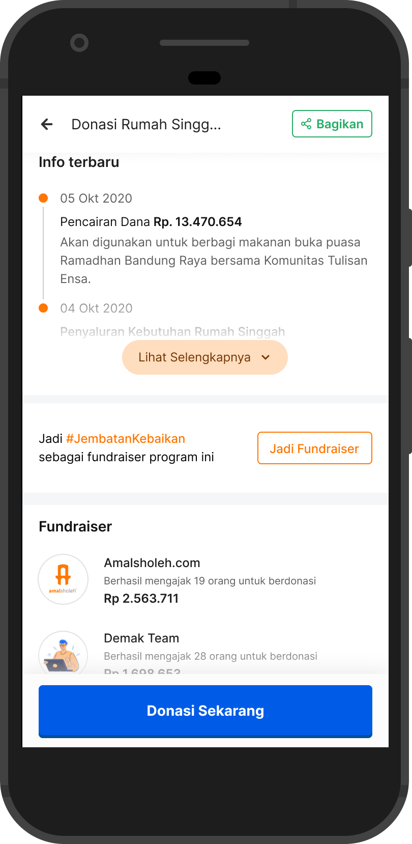
- The share button is now placed in the top bar for better discoverability.
Checkout Page
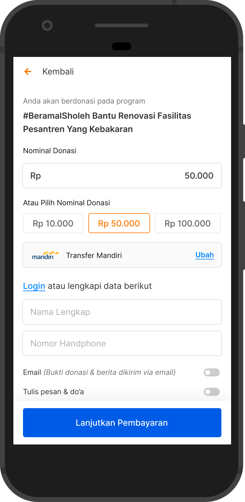
In this latest design version, I restructured the hierarchy by placing the donation amount field at the top, as many users prefer to input their own amount rather than selecting from the recommended options.
Next, the most frequently chosen donation amounts are displayed below the input field, showing the top three most-selected amounts. This approach encourages user freewill, allowing them to enter their desired amount first before considering system-recommended options.
Payment & Form Improvements:
- After selecting a payment method, the required form appears within the same viewport (if the user is not logged in).
- The form is streamlined to save user time, displaying only mandatory fields (name and phone number).
- Additional fields are hidden by default but can be revealed if the toggle is switched on.
Impact and Outcome
So, after releasing this updated design, we decided to test it for one month to evaluate its impact. Was it successful, or does it need further iteration? Here are the results we obtained.
Key Results
Over the span of one month, we successfully achieved a 20% increase in the visitor-to-checkout conversion rate, as planned.
- Average visitors per month: ~20,000 users.
- Average users proceeding to checkout: ~4,000 users
This data shows a significant improvement, but further analysis will determine whether additional refinements are needed for continued optimization.
Lesson Learned
Sometimes, when developing a feature, some companies don’t require full research upfront. For example, in my current company, our CEO’s message is clear: “Fix it fast, release it fast.”
This approach creates a fast-paced product development cycle, allowing us to deliver real features to users quickly. Since we don’t have the luxury of time to conduct qualitative research or usability testing, we prioritize rapid iteration based on real-world feedback.
Larger companies often follow a rigorous research process, but for a company still in the growth and development stage, with limited time and budget, this approach feels more realistic—enabling us to gather real insights as quickly as possible.
For me, this has been an invaluable experience, pushing me to adapt, make quick decisions, and learn from real user interactions rather than relying solely on pre-launch studies.