Some explicit data is not displayed due to NDA restrictions.
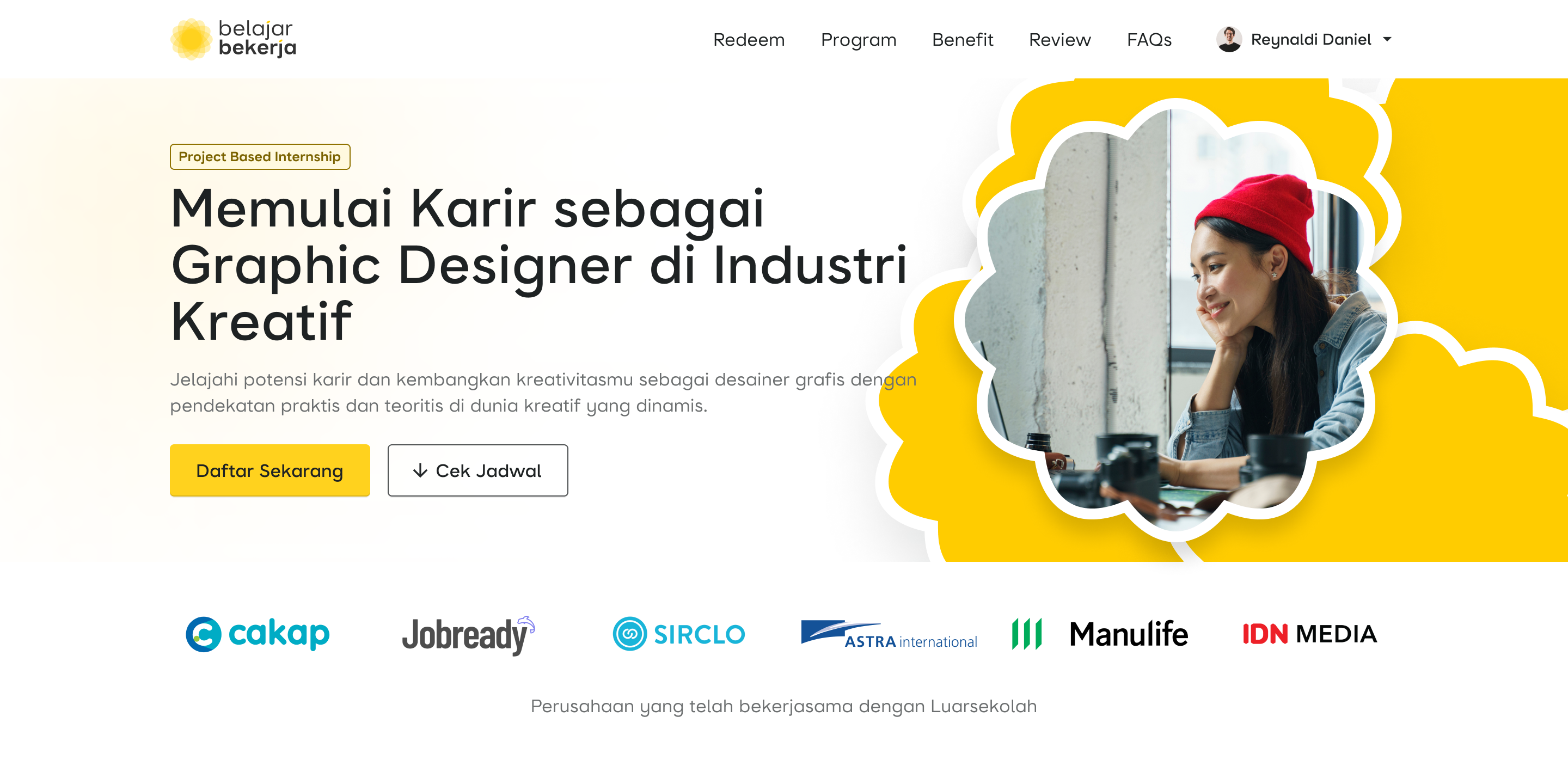
From Frustration to Conversion: Optimizing Project-Based Internship (PBI) Purchase Flow
Increasing Conversion Rate Through Simplified Registration and Comprehensive Content
Introduction
PBI, or Project-Based Internship, is a platform launched to help individuals gain work experience, especially in the industry. Our product aims to serve as a bridge to make it easier for users to secure jobs, particularly fresh graduates. I joined this team in early 2023 as a product designer, and we successfully launched it to the public in mid-2023. Then, I rejoined the team in June 2024 and contributed to the successful release of a major update in July 2024.
Timeline
June 2024 - July 2024
My Role
Product Designer
Team
1 Product Designer, 1 Product Owner, 1 Marketing Manager, 1 Developer
Current Problem
The primary goal of this platform is to serve as a space for users to gain internship experience to support their careers. However, users often experience frustration due to the poor checkout process, which discourages many from applying for internship programs.
This pain point significantly impacts users' perception of the platform and the company's business objectives. The first step we took was identifying and analyzing existing data, which revealed an 11.8% decline compared to the previous batch.

Time to Discover The Issue
With limited time—since Batch 4 was already open when we started this project—our target was to make Batch 5 accessible to the public with this major update.
The first step I took was conducting a simple research by placing a feedback pop-up message whenever users dropped off during the checkout journey. The results revealed two strong reasons behind user frustration:
- Frustration due to multiple blockers, such as mandatory sign-up and WhatsApp number verification.
- The program description was not engaging at all.
💬 On average, user' says
"The internship registration process is quite frustrating. The explanation about the internship program is less appealing."
I attempted to map the flow to better understand the user journey and the registration process for the internship program.
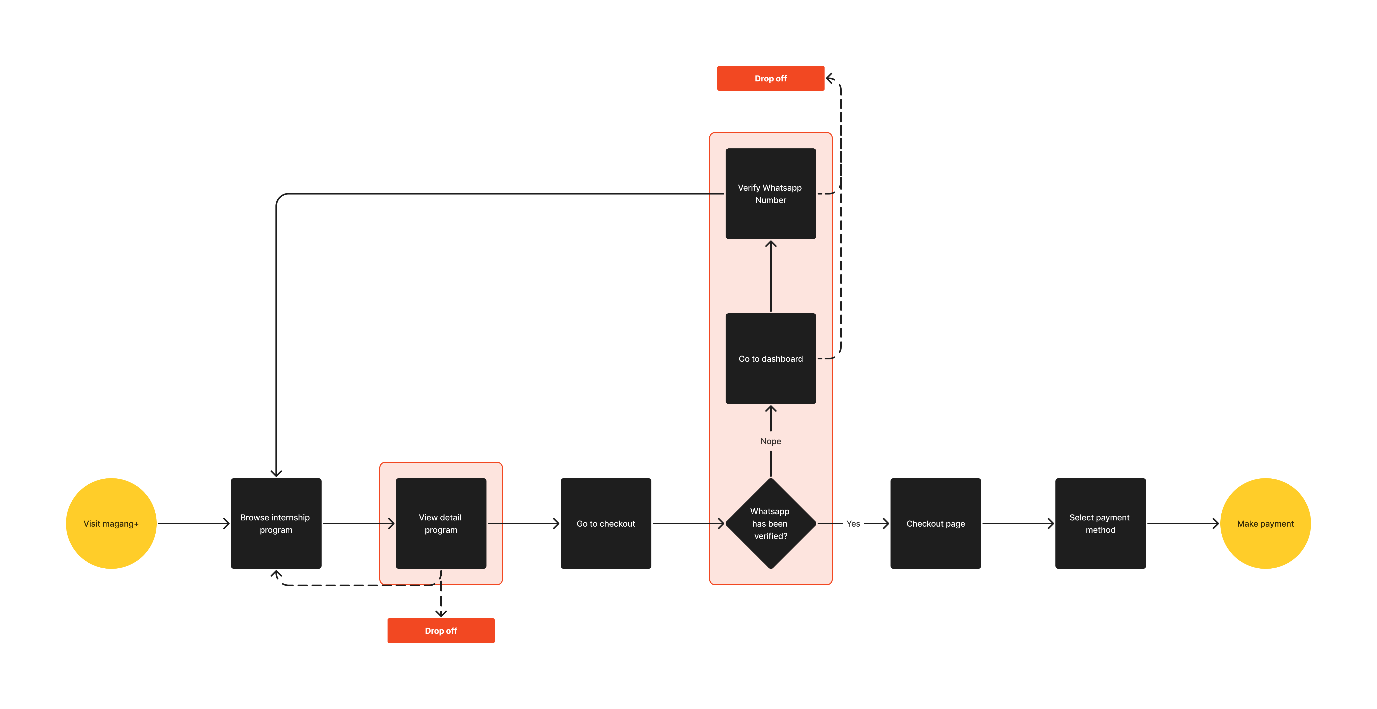
Based on the flow and user feedback data, the highest drop-off rates occurred when users were reading the internship information and when they were required to verify their WhatsApp number. This became our primary focus to address (highlighted by the red block).
How Might We...
“Make content more aligned with user needs while also making the checkout process easier and more seamless for them?”
Now, we have two main focus areas to address:
- Ensuring that the content provides a positive impression and aligns with user needs.
- Creating a seamless checkout process by eliminating unnecessary blockers.
Opportunities
We identified key opportunities to drive users to register for the program:
- Adding content that aligns with user needs.
- Creating a checkout experience that doesn’t require account sign-up.
- Providing benefits for users who join.

Let's Audit the UX
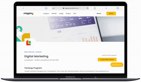
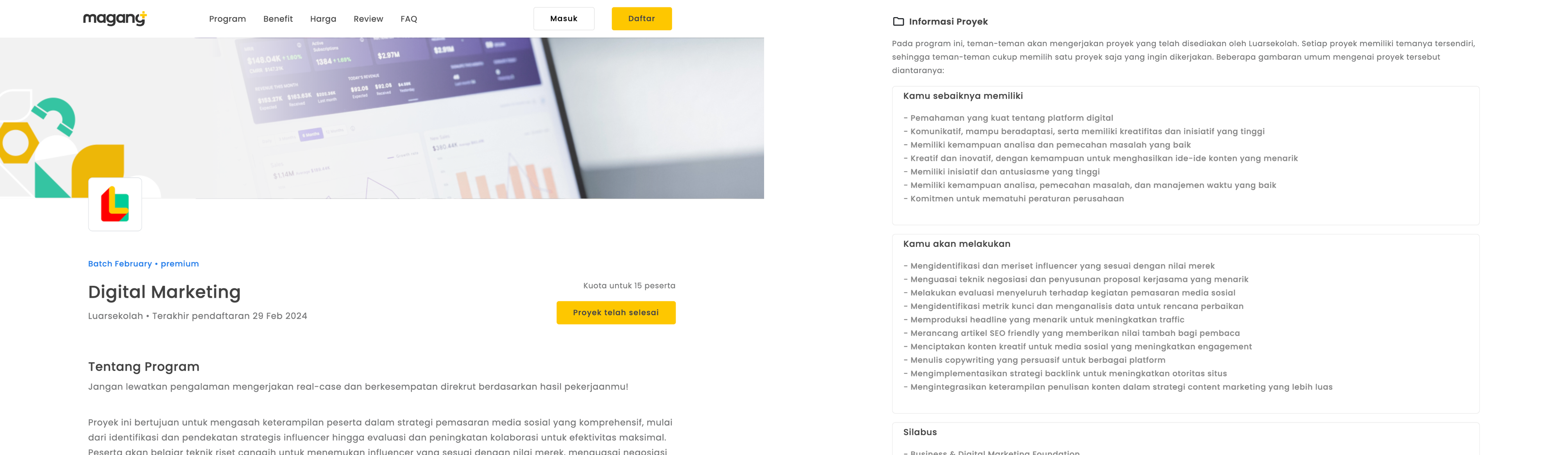
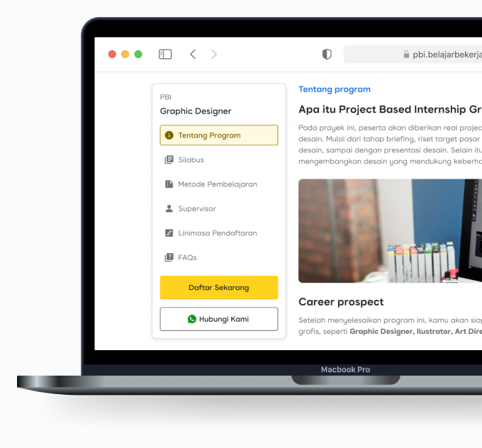
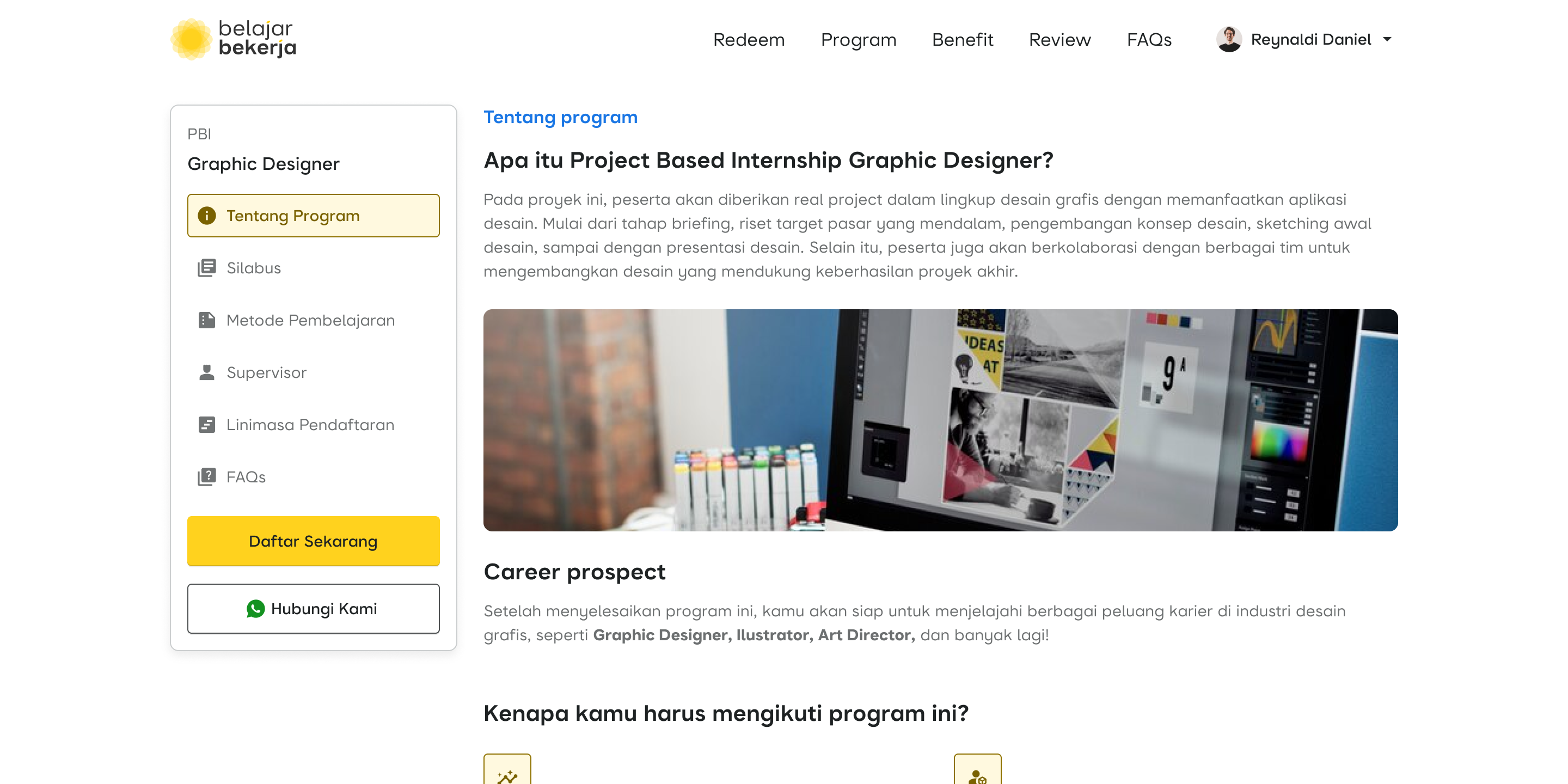
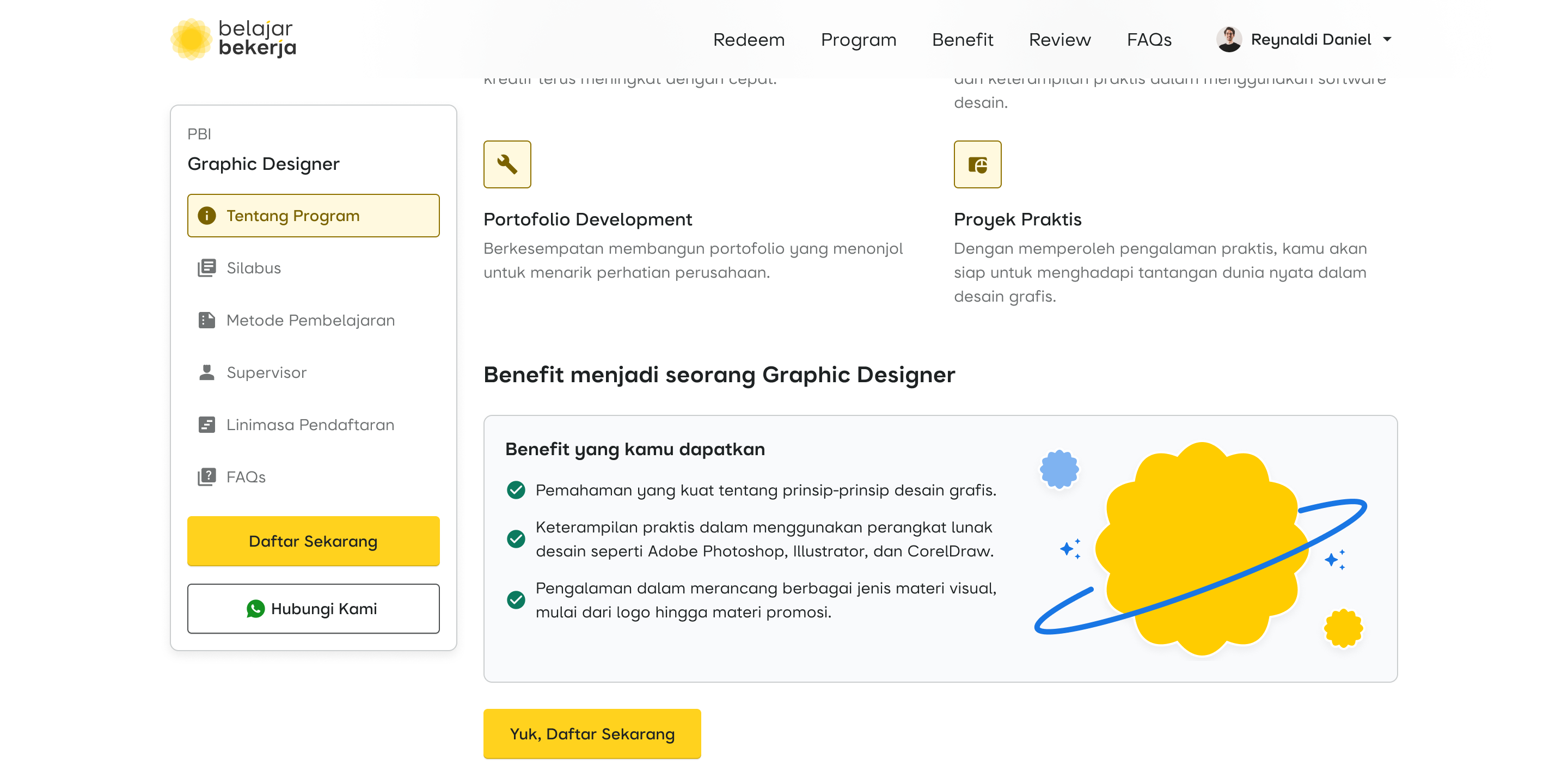
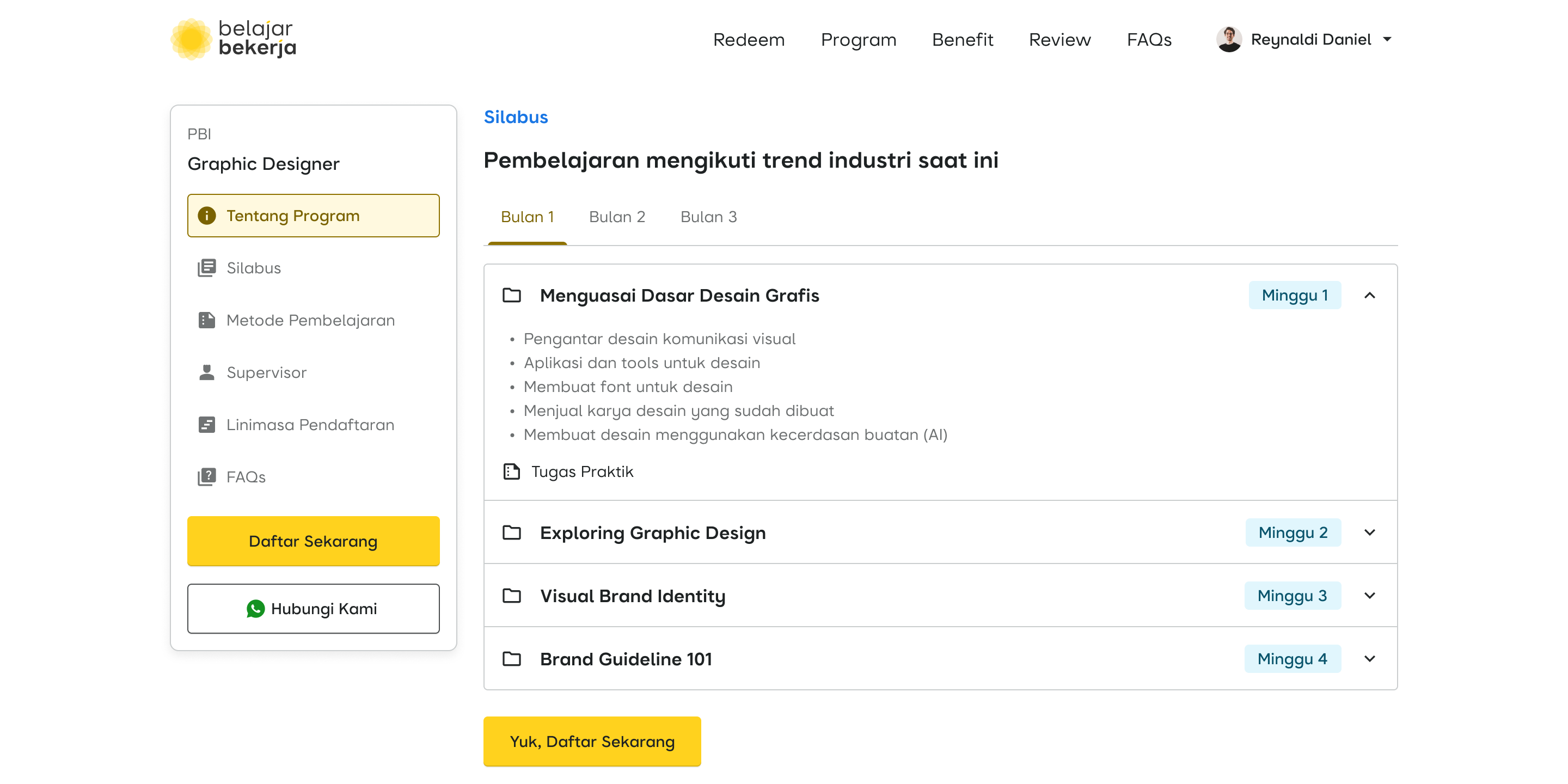
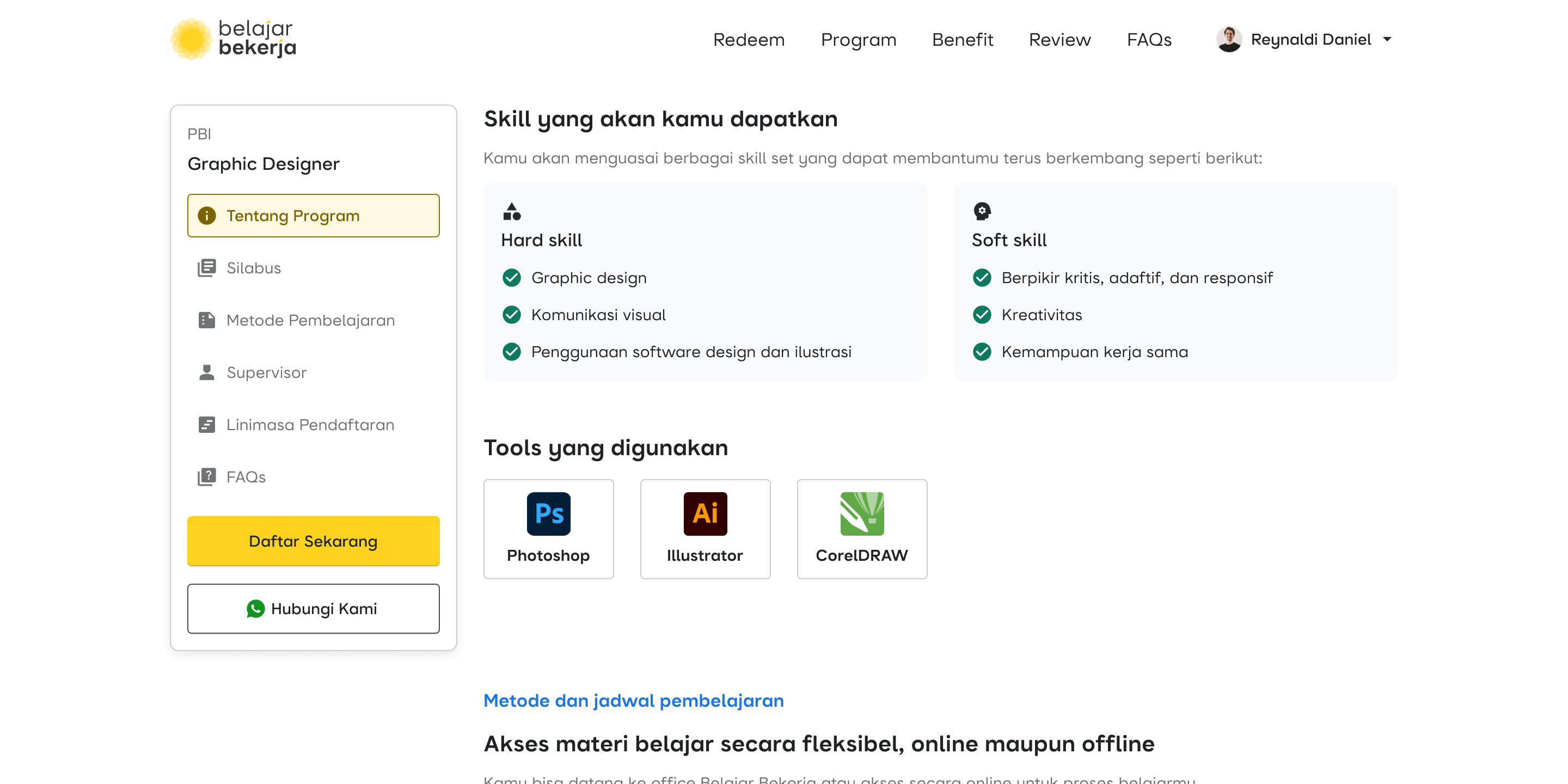
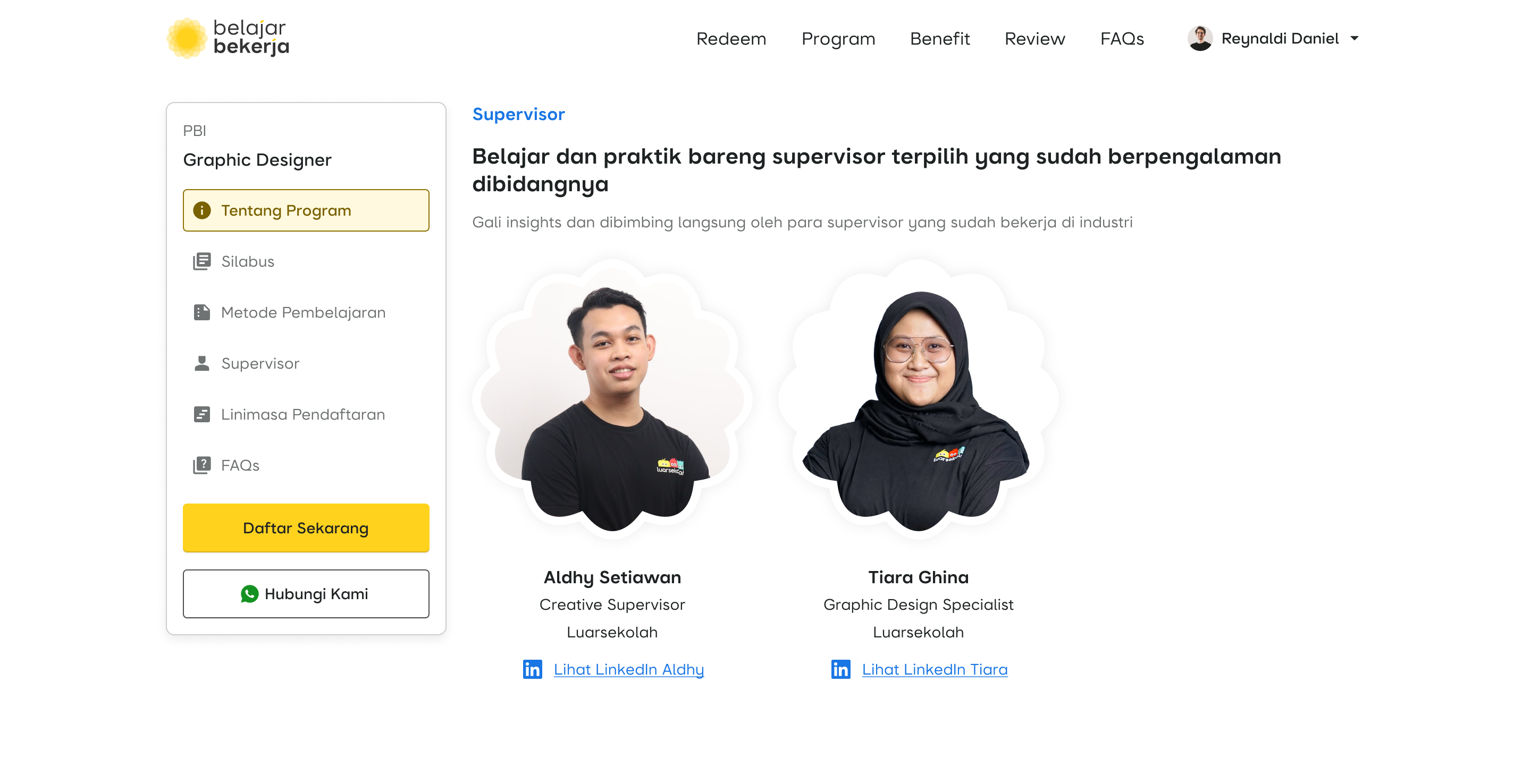
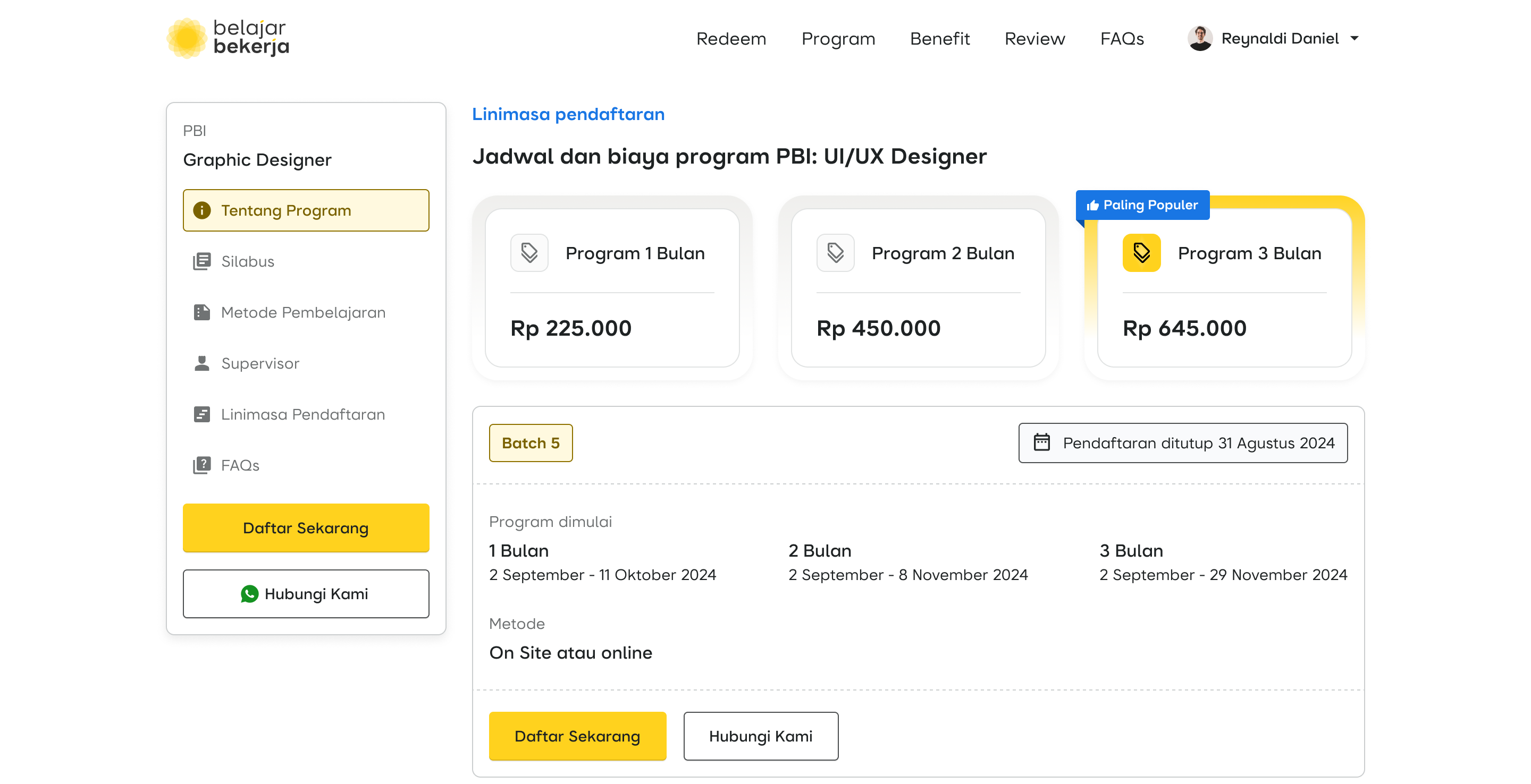
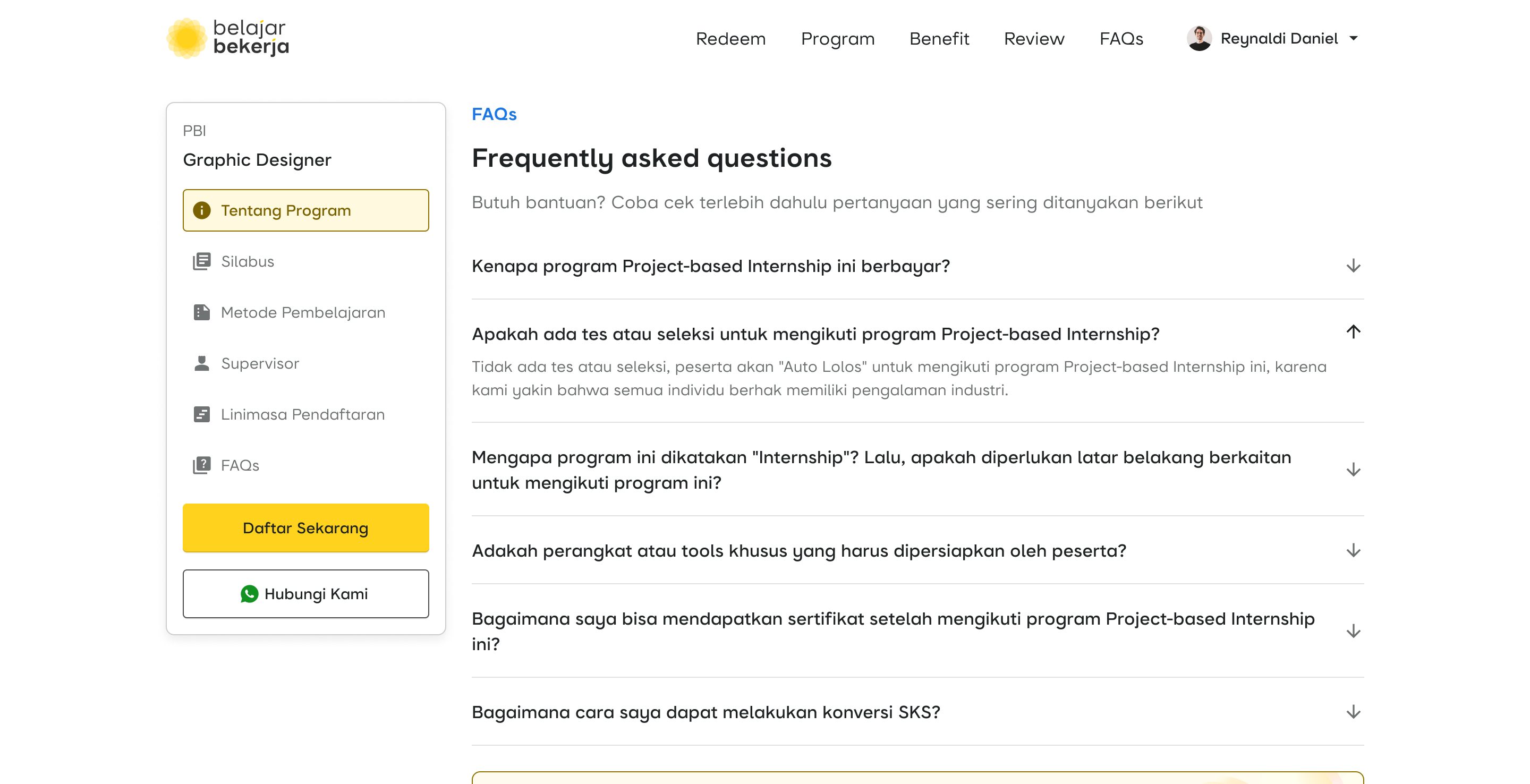
First Case: Detail of Program
Many users leave the website when reading the internship information. The program details should provide engaging and compelling information to encourage users to register, but instead, they have the opposite effect.
Here are the preview
Competitor Analysis
For comparison, we conducted benchmarking against several platform with similar products. These include Purwadhika, Hacktiv8, and Revou.
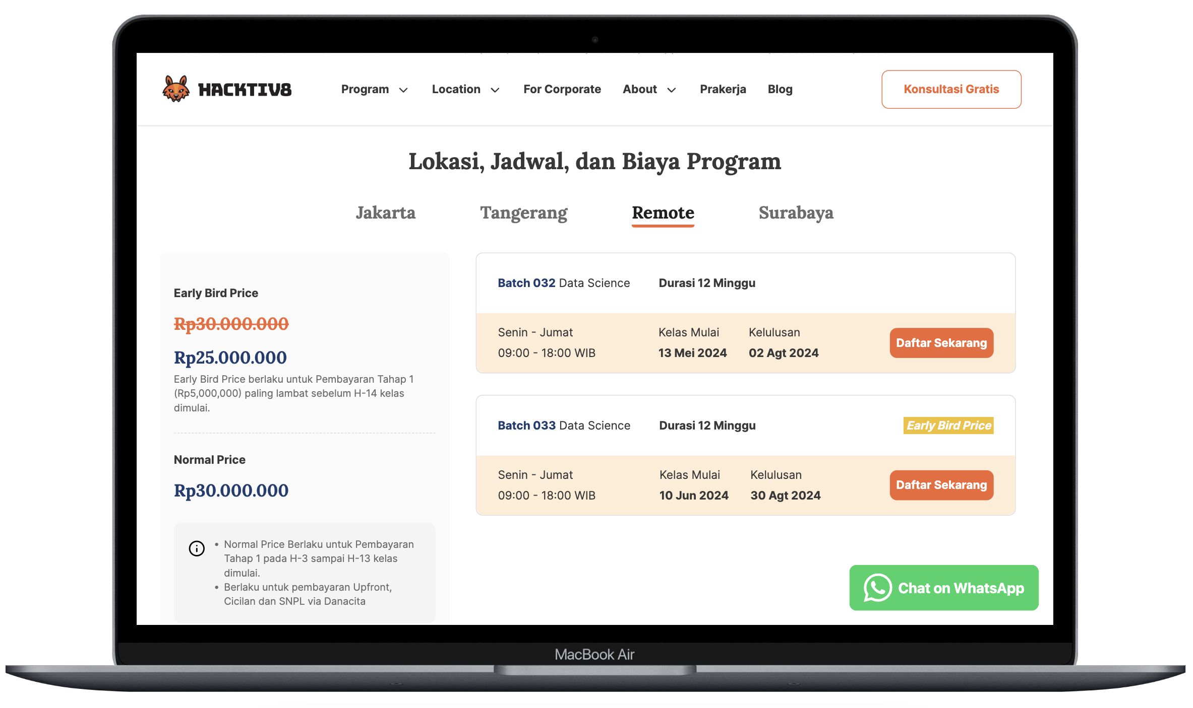
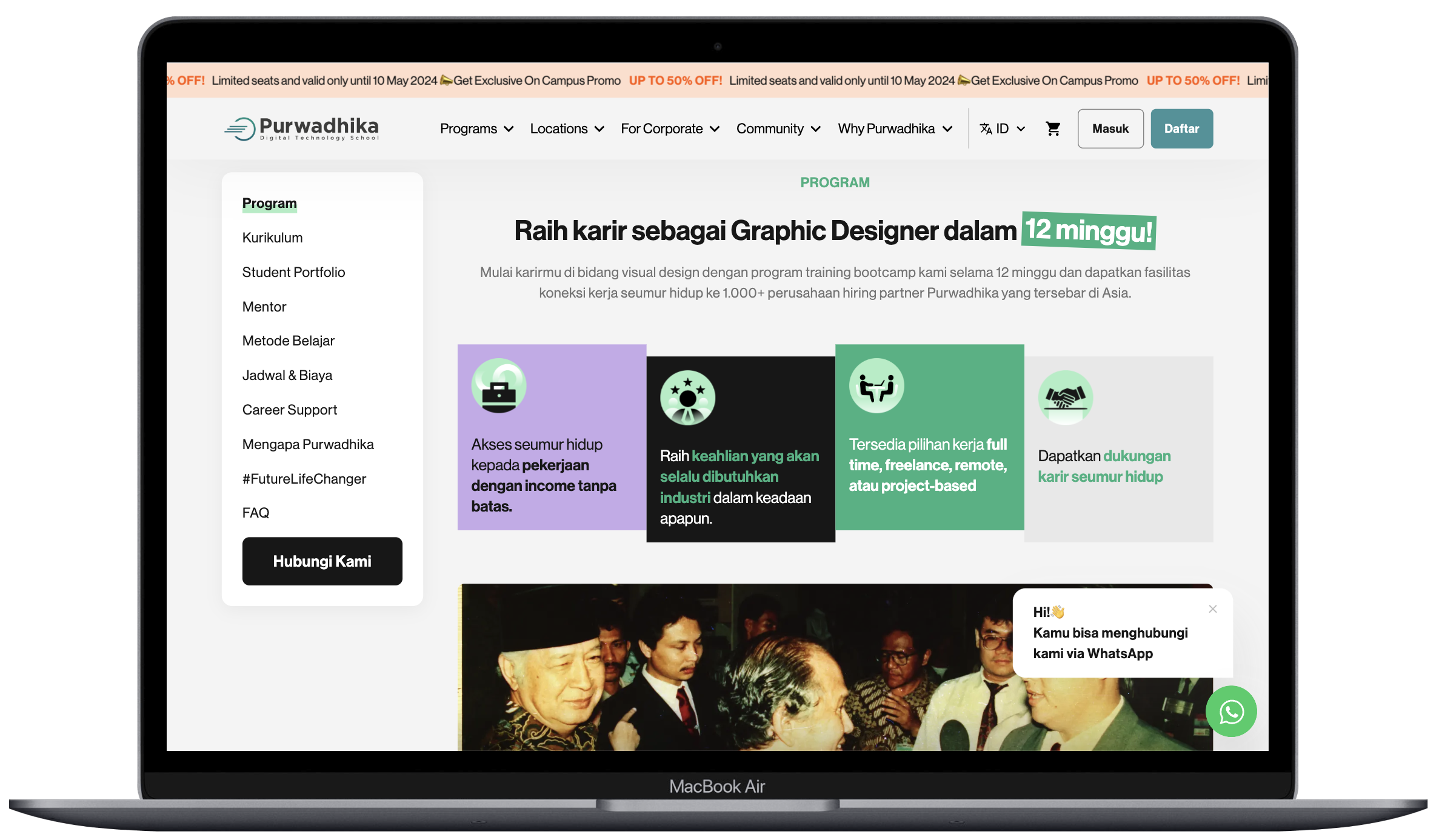
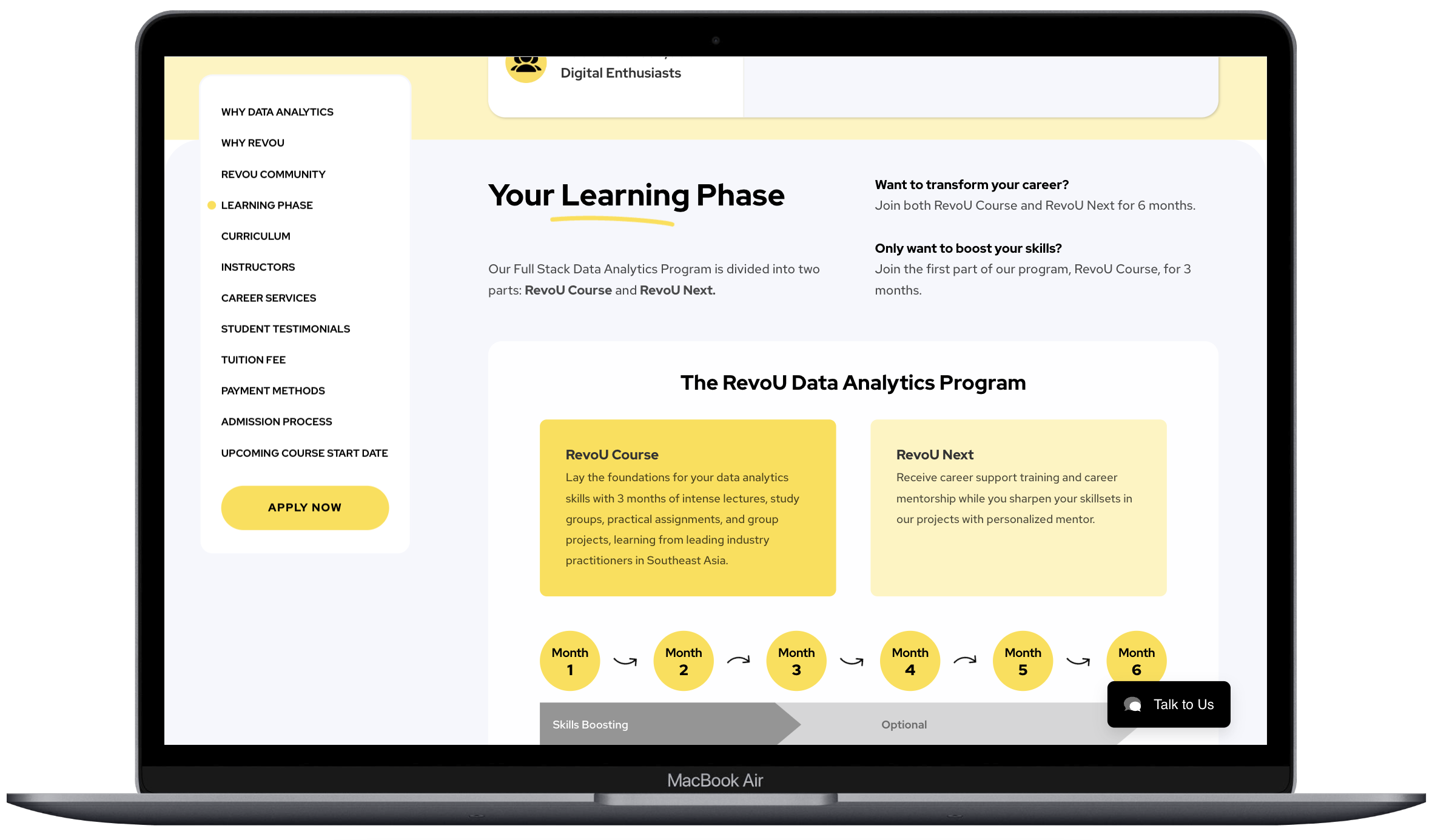
From these three platforms, both visually and in terms of content, they provide comprehensive and engaging information. When compared to our platform, it's clear that visually it's far less appealing, with a flat and dull design, coupled with incomprehensive content, resulting in a lack of user interest in the available programs. This information has been conveyed to the marketing and education teams for further study on what content and unique selling points (USPs) should be included on our platform to meet user needs and expectations.
After discussing with the relevant team, it was agreed to add several important additional contents such as curriculum, learning methods, mentors, etc. Of course, with the increasing amount of content, it will also require more time for users to read through all the available content.
How Might We...
“save users' time in accessing and reading available content?”
Before I jump into the solution, I found an insights from these platforms:
| Platform | Sidebar Navigation |
|---|---|
| Revou | ✅ |
| Purwadhika | ✅ |
| Hacktiv8 | ❌ |
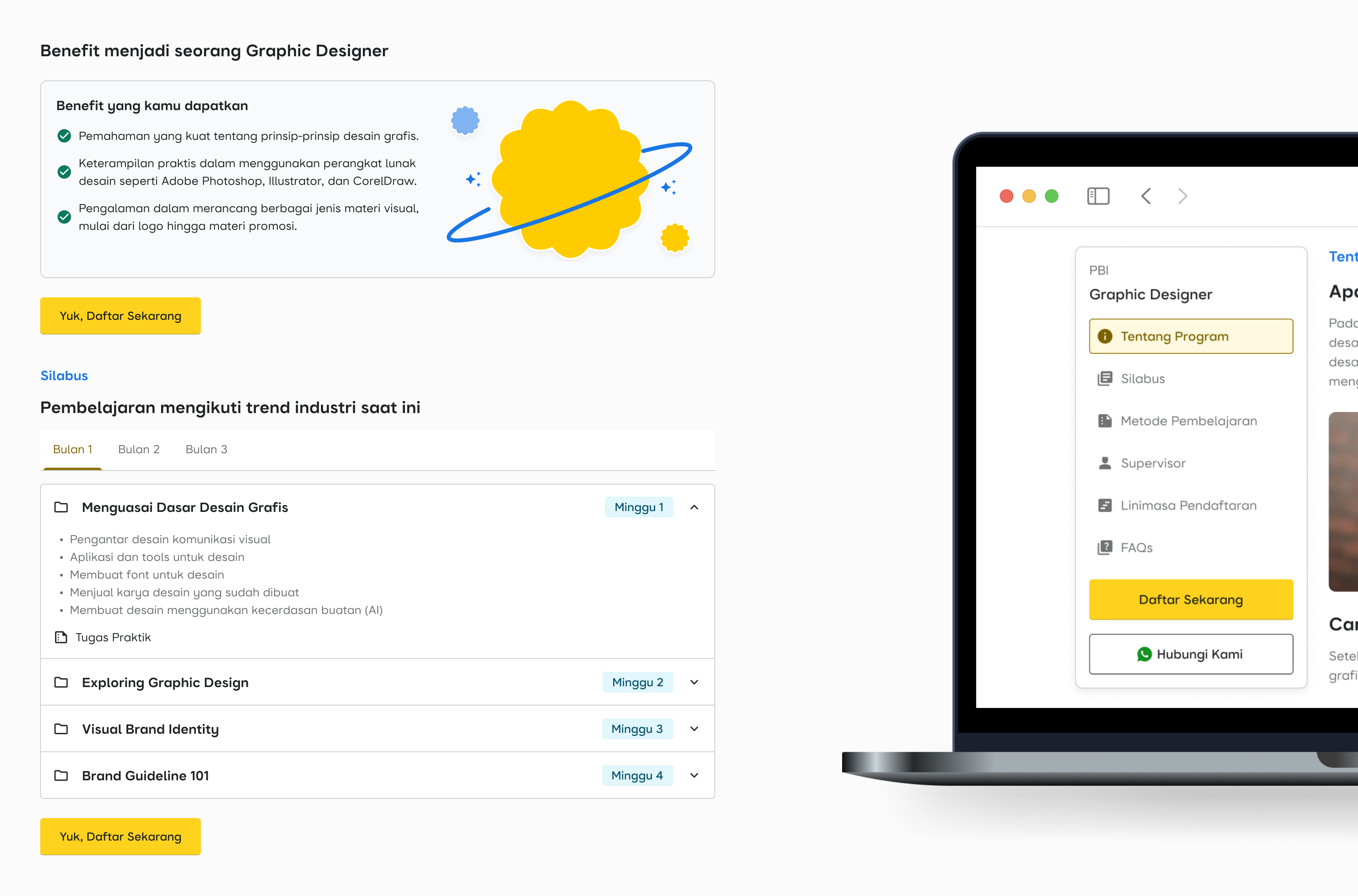
As seen in the insight table, some platforms implement sidebar navigation on their pages. The implementation of a sidebar can assist users in accessing which content they want to view first, or even jump from one content to another. In other words, it can serve as a shortcut for users to access the available information.
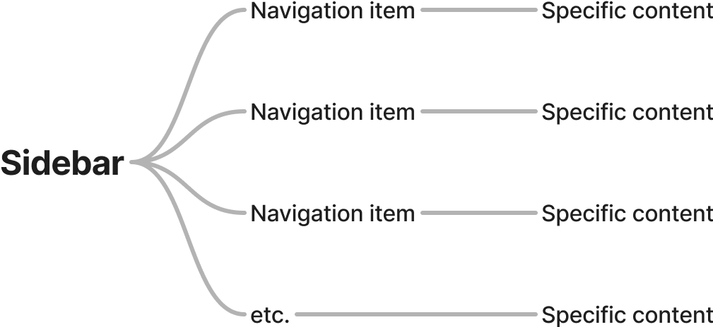
I thought that adding a sidebar function would make it easier for users to navigate the content, allowing them to focus directly on the information that interests or benefits them. After discussing this with the team, we agreed to implement this feature.

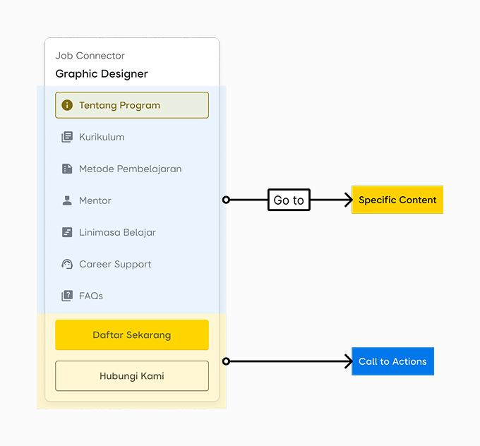
Design Proposal

The Second Case: Purchase or Checkout Process
The current checkout process on our platform indeed requires users to verify their WhatsApp numbers. This is essential for the internal team to gather data and communicate with participants. However, this causes some users to not proceed with the program purchase process, leading to drop-offs in that journey and affecting the completion rate and conversion rate.
How Might We...
“simplify the checkout process to minimize user effort?”
If we look at the internship program checkout process, the system will first check whether the user has previously verified their WhatsApp. (Logged in state)
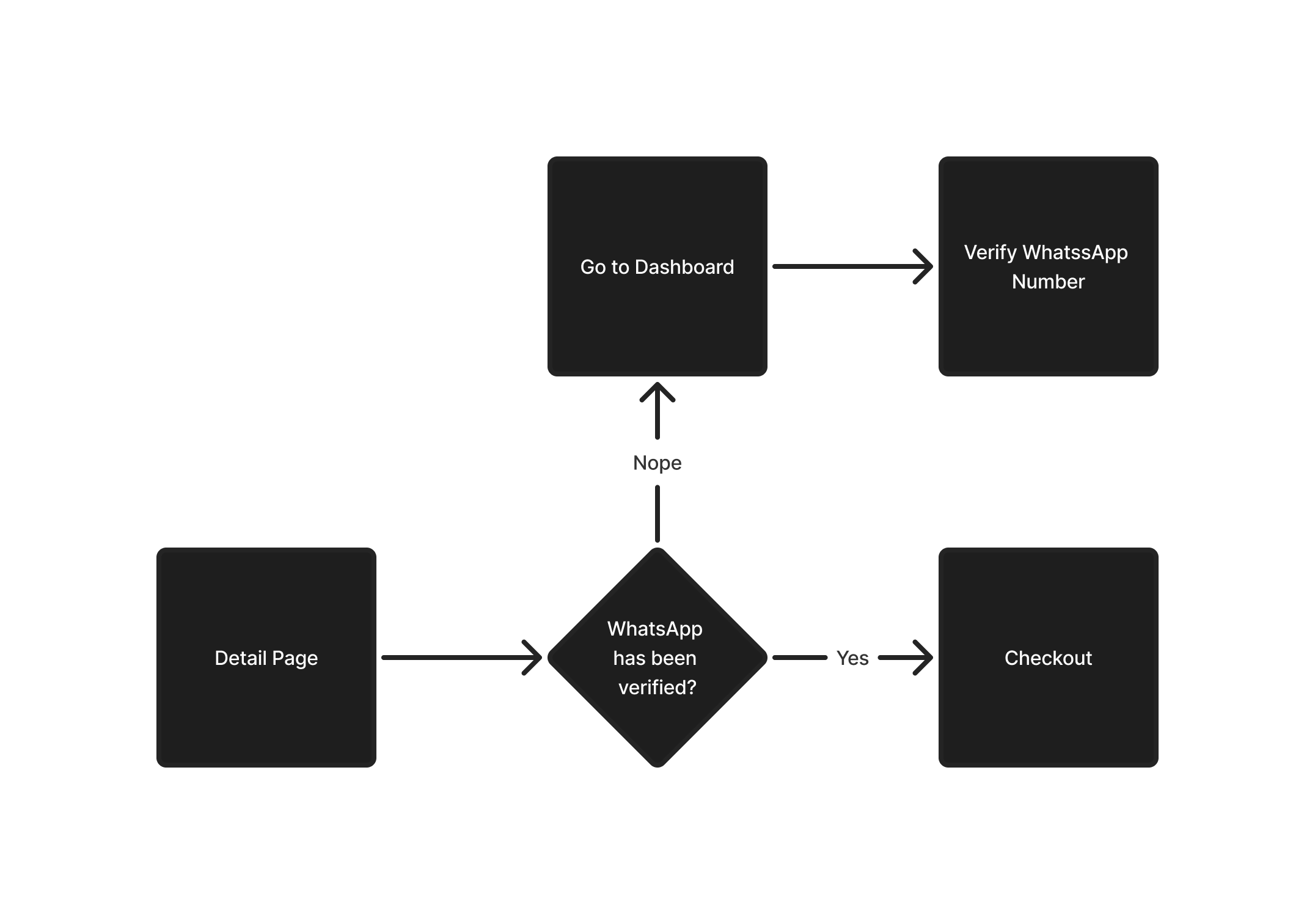
This is where drop-offs often occur, and this step or journey is crucial for our business goals. On all three competitor platforms, they implement a registration process that is incredibly straightforward. Users don't need to log in or have an account beforehand to purchase a program. Additionally, they utilize a form that will be forwarded via email or WhatsApp.
| Platform | How to Buy | Login Required? |
|---|---|---|
| Revou | Third Party Form | ❌ |
| Purwadhika | Form | ❌ |
| Hacktiv8 | Form | ❌ |
I thought this was something good for us to implement on our platform to simplify the program registration process for users. Yes, we all agreed.
Here is the new checkout flow for our platform:
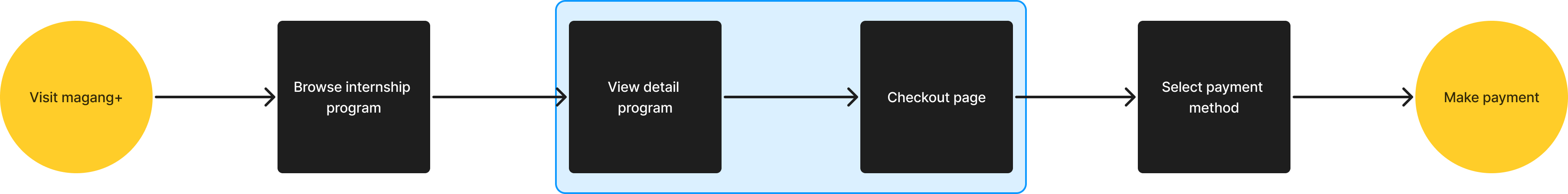
The decision is based on business goals that prioritize enabling users to purchase the programs as quickly and efficiently as possible without any interruptions in the process. Now, all users—even those without an account—can register and purchase programs that match their needs and interests without facing blockers like account registration and WhatsApp number verification upfront. I believe this change will benefit both users and the company.
Also, we attempted an experiment by placing CTAs in every crucial section so they can immediately take action by registering or purchasing a program. Although the sticky sidebar displays the same CTAs, we want to determine if placing them in various sections can enhance user awareness. Another consideration is mobile responsiveness, which would be challenging if we relied solely on CTAs in the sidebar.

Final Design Deliverable
Handed-Off July 2024, published first week of August 2024
Scroll horizontally for more
Impact and Outcome
After we launched these changes for the next batch, the impact was quite significant.
- Program purchases increased by 38.2% compared to the previous batch.
But, wait...
Although conversion rates improved compared to the previous batch, the visitor data revealed a unique pattern. The highest number of website visitors occurred between Q3 and Q4, indicating that people tend to search for internship programs when the "season" arrives. The data also supports this trend, as the major update was published during this period.
To ensure that our designed solution had a real impact, we analyzed other relevant data points. After comparing the results, we discovered additional positive effects, indicating that the solution was effective and well-utilized by users.
- The average engagement time on the detail page increased from 30 seconds to 60 seconds.
- The implementation of the before-login purchase system also yielded positive results.
Since its release in July 2024, an average of 41.05% of users have purchased programs without logging in 🚀
Lesson Learned
In this project, I've realized that sometimes to create a product that is accepted by users, it's not always necessary to conduct research from A to Z. Simply knowing the root cause, we can directly focus on the core issue. With a good empathetic approach, we can feel what the users feel, enabling us to provide suitable services more wisely, and they will be assisted by the solutions we create.