Redesign Supervisor Dashboard
Enhancing the functionality and key features used by supervisors to improve ease of use
Introduction
PBI, or Project-Based Internship, is a platform launched to help individuals gain work experience, especially in the industry. Our product aims to serve as a bridge to make it easier for users to secure jobs, particularly fresh graduates. In every internship program, each role is assigned a mentor or supervisor who provides work assignments, mentoring, and learning materials for their mentees.
Timeline
January 2025
My Role
Product Designer
Team
1 Product Designer, 1 Product Owner, 1 Developer
Current Problem
Many supervisors complained about poor navigation on their dashboard. Specifically, when giving assessments, they found the process confusing and repetitive, making it exhausting to complete evaluations.
This issue led to delays in mentees receiving feedback from their supervisors, resulting in a high number of inquiries to our customer service about slow evaluations.

Time to Discover The Issue
To simplify the root cause analysis, I first mapped out the flow. The focus was on the process of supervisors providing evaluations to users (mentees).
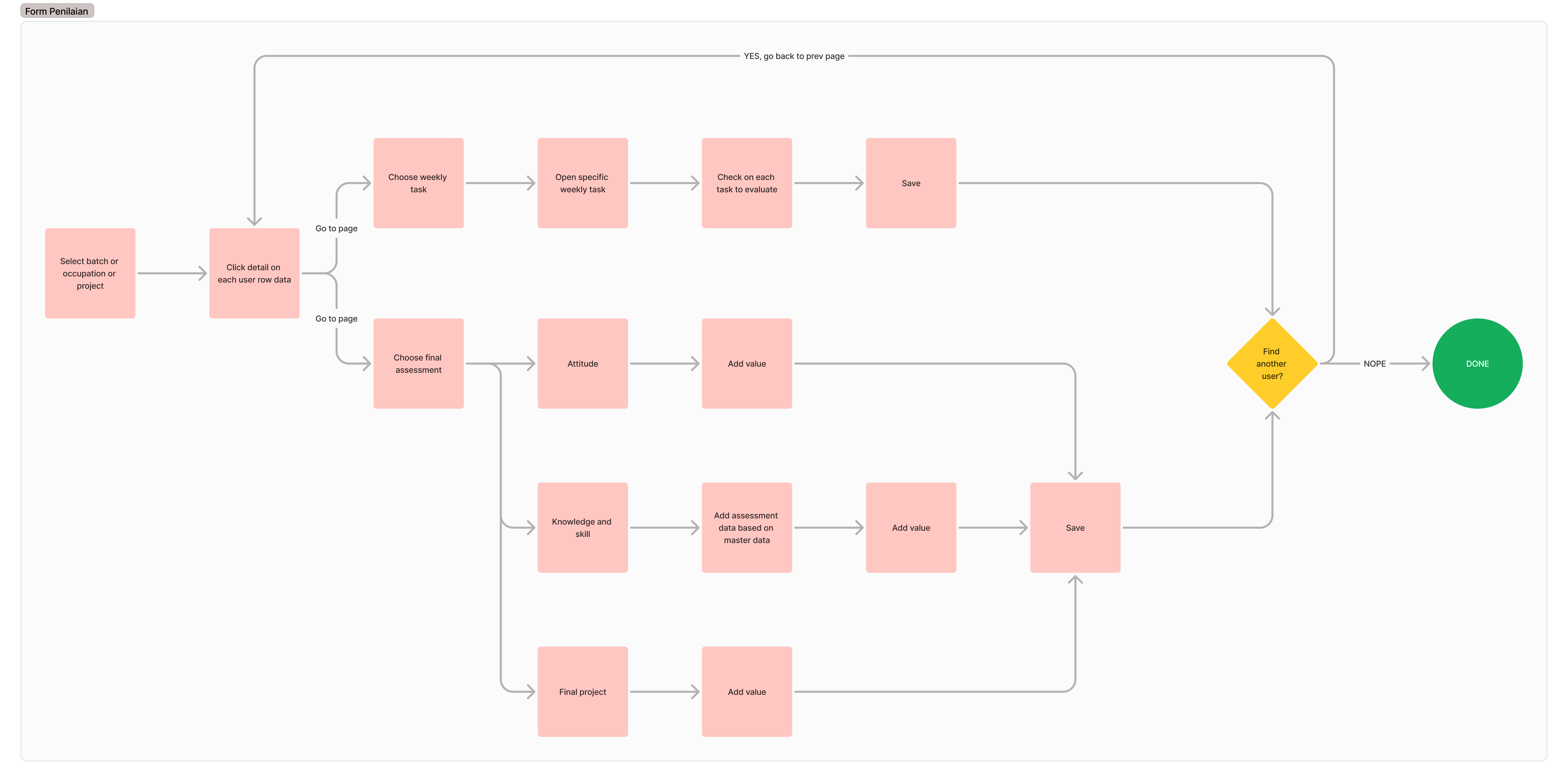
Looking at the flow, it’s clear that the evaluation process can be exhausting for supervisors. They have to select users one by one and perform repetitive tasks. If there are fewer than 10 users, it might still be manageable—but what if there are more? It makes sense why many users complained about delayed evaluations. This became our primary focus for improvement.
Upon closer inspection, when supervisors provide evaluations—especially final assessments—they need to add evaluation data. This data comes from a master evaluation that the supervisor previously input. Similar to weekly task assessments, supervisors must repetitively add the same data for each user.
Therefore, I took the initiative to make changes to the master evaluation system, as it directly impacts how supervisors provide assessments, making the process easier and more efficient.
Now, I have two main focus areas to improve:
- Master Evaluation Flow
- Evaluation or Assessment Submission Flow

Let's Audit the UX
First Case: Master Data Flow
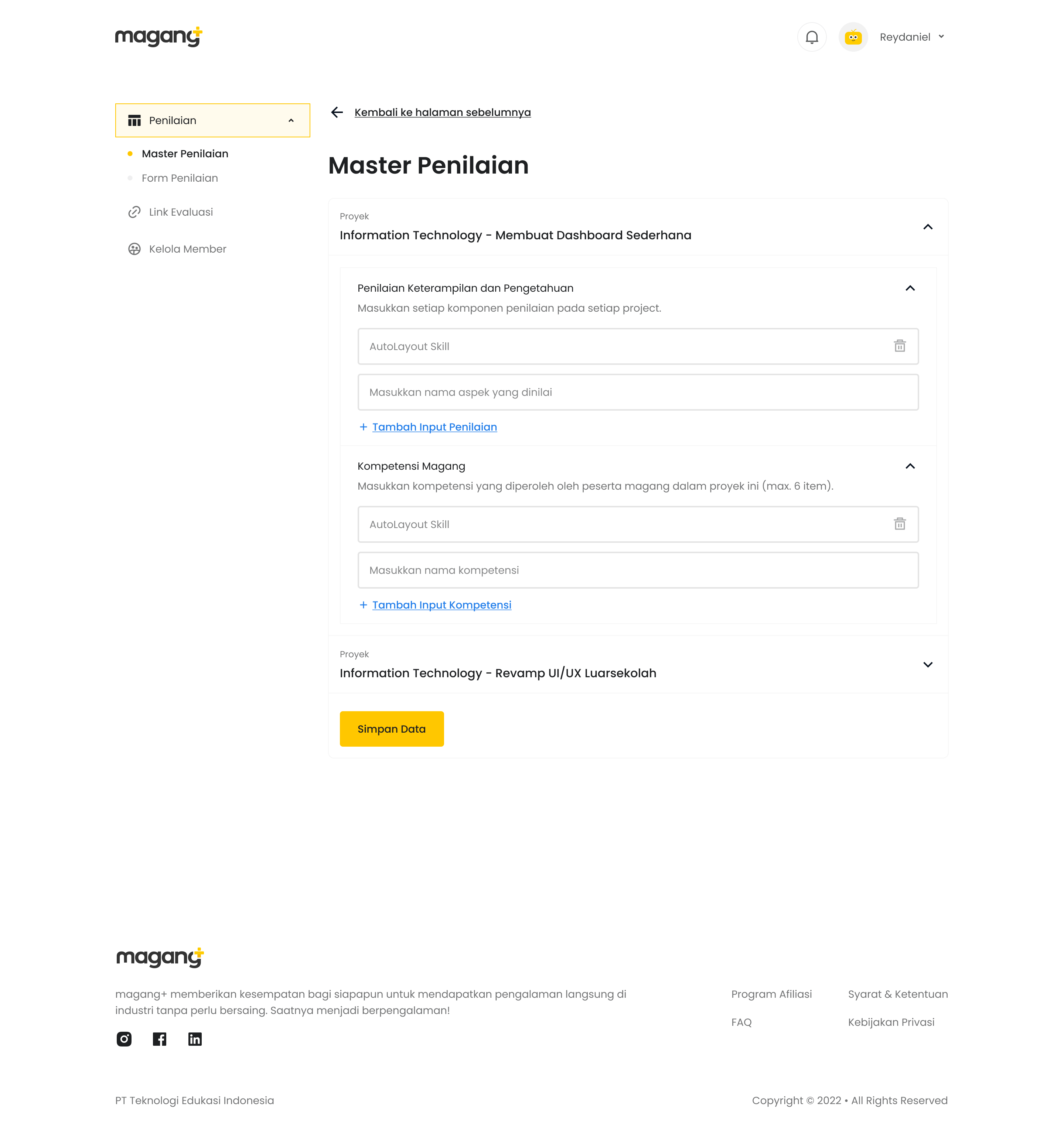
Why did I include this case or flow as a consideration for change? Because I believe that by introducing a new data type—evaluation type—we can make the assessment process easier for supervisors.
How Does it Work?
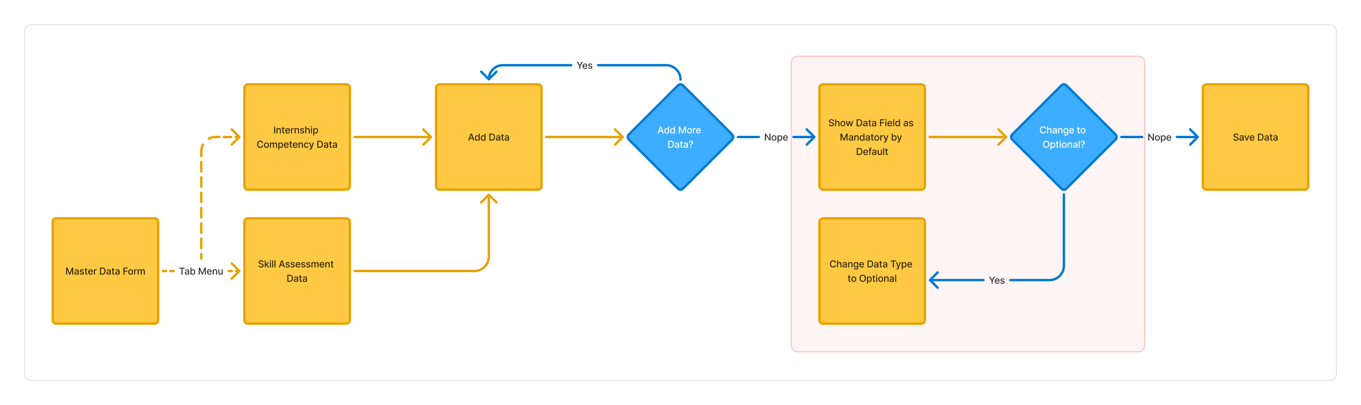
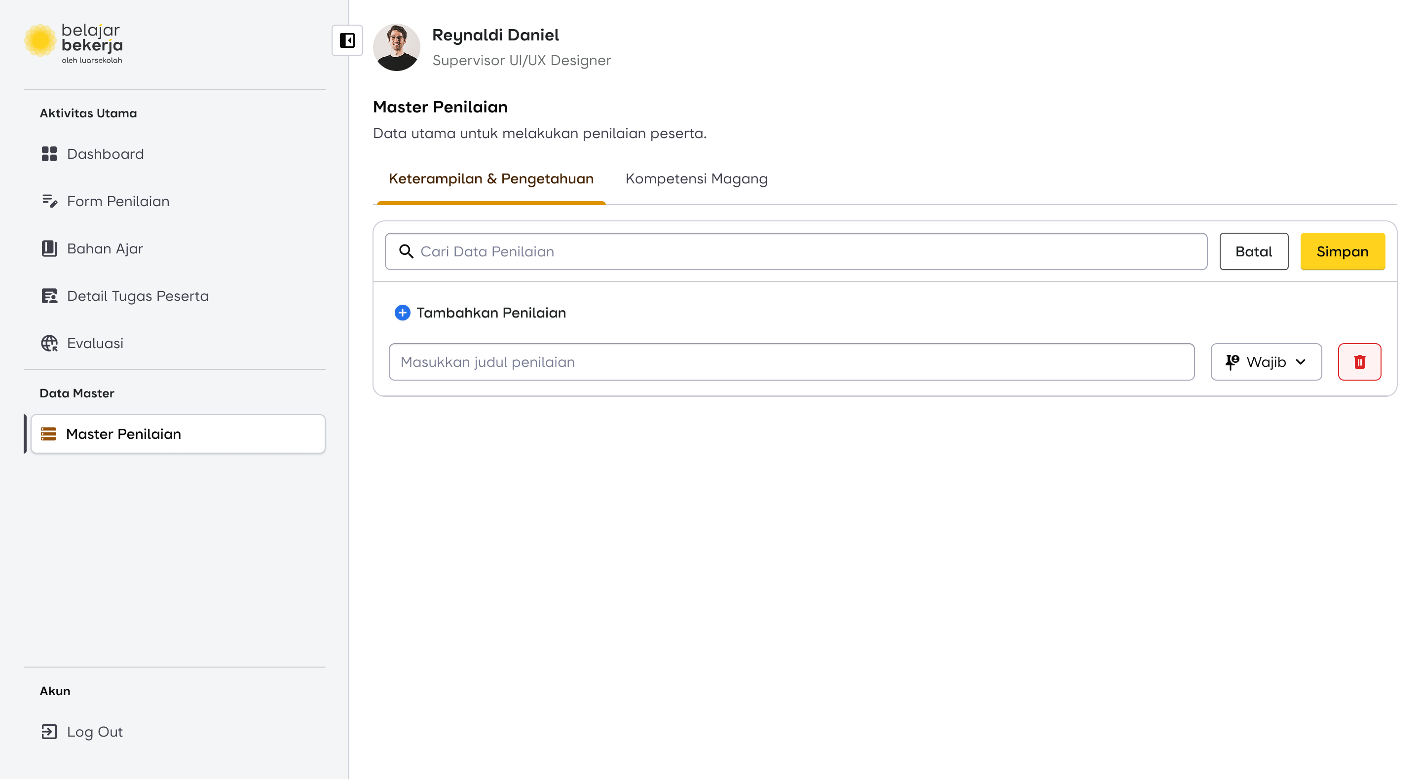
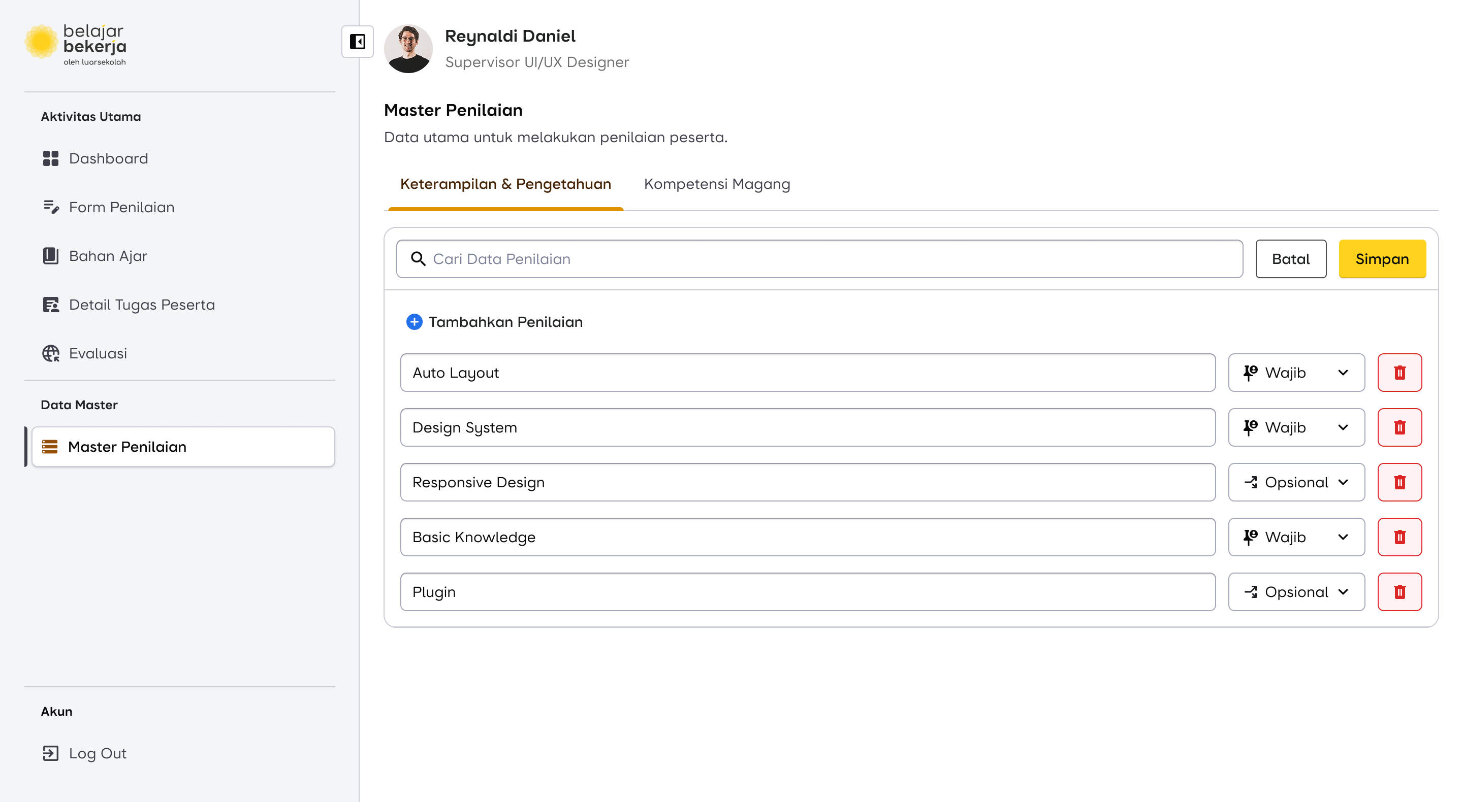
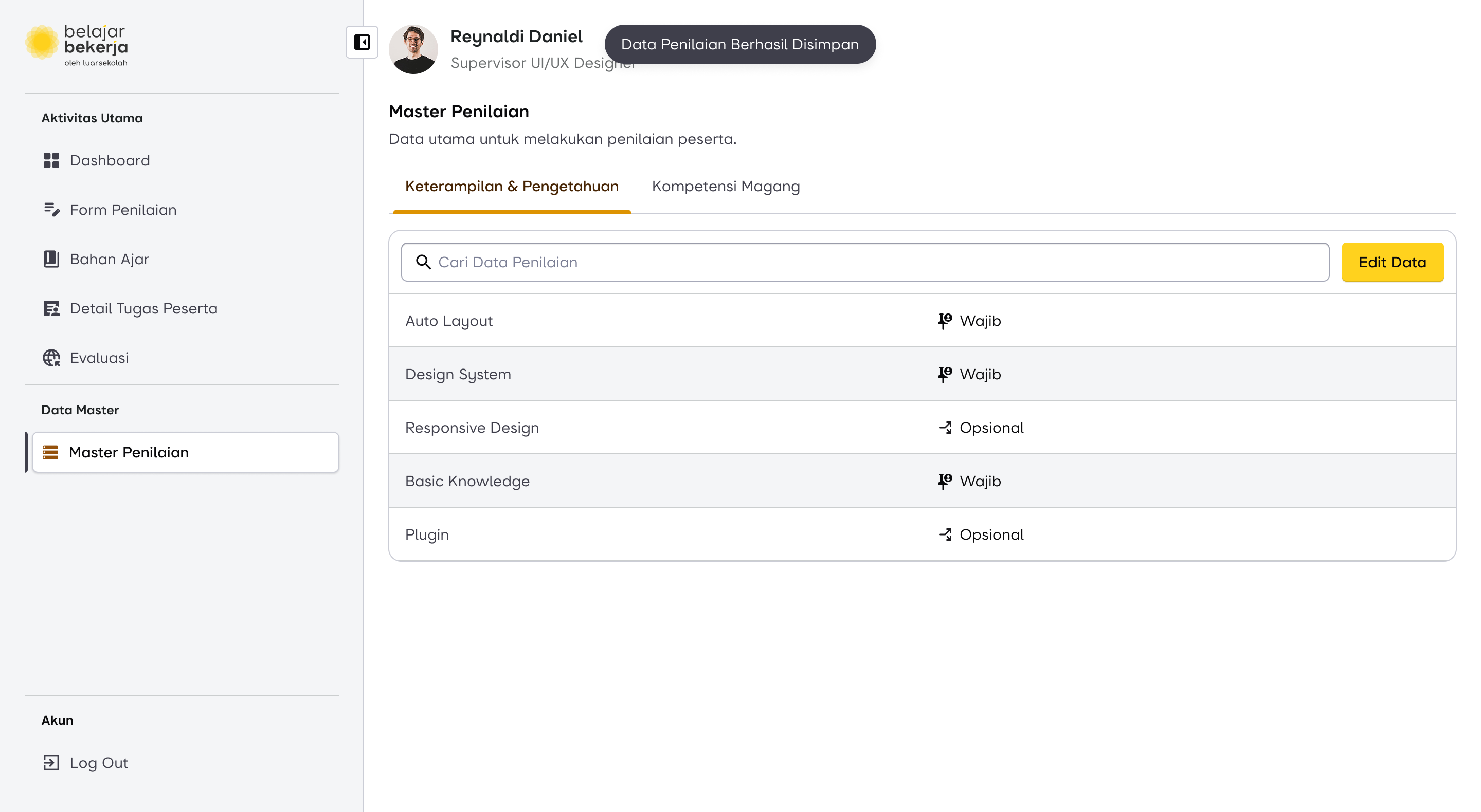
The solution I introduced includes adding one additional step after the supervisor (SPV) inputs the evaluation data fields (highlighted in red).
- By default, all evaluation fields are marked as mandatory. This means these fields will automatically appear for every user to be assessed.
- If the supervisor considers a specific evaluation field to be optional, they need to manually change its status.
- Optional data fields will not appear by default for all users. Instead, supervisors must manually add them for users who require those specific assessments.
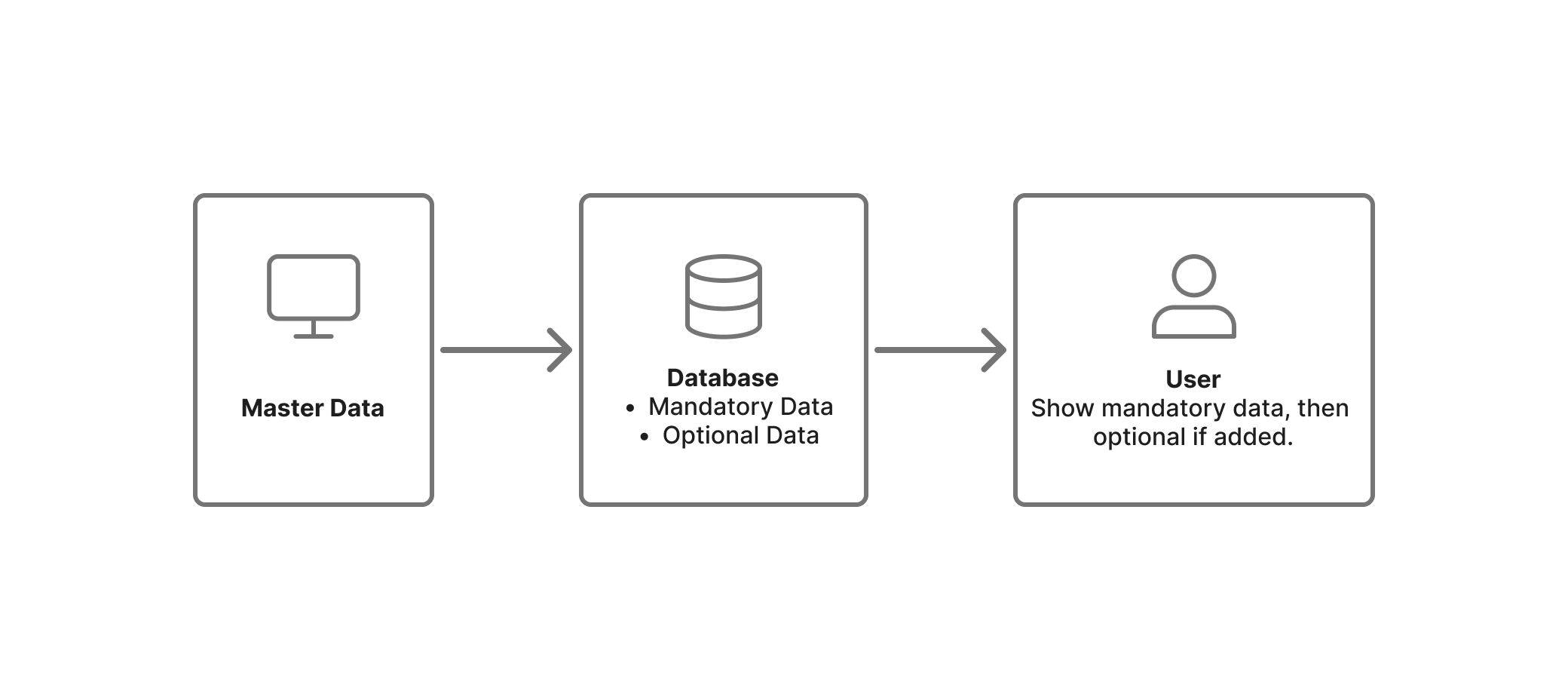
This approach reduces repetitive tasks and ensures a more efficient evaluation process.

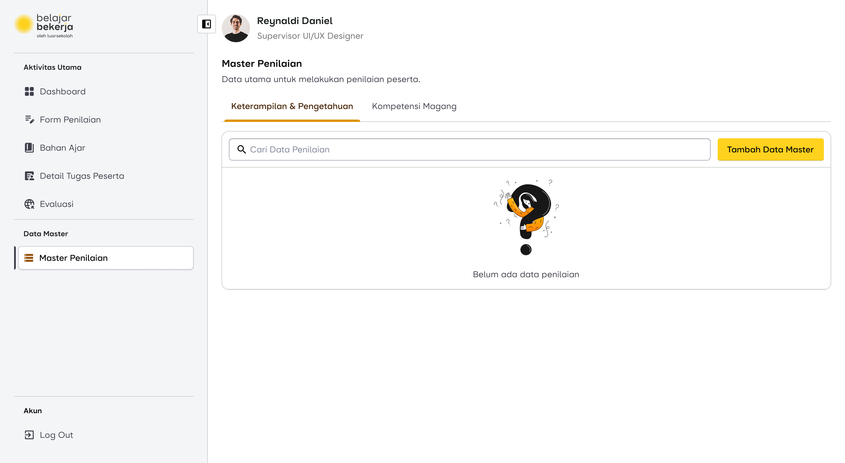
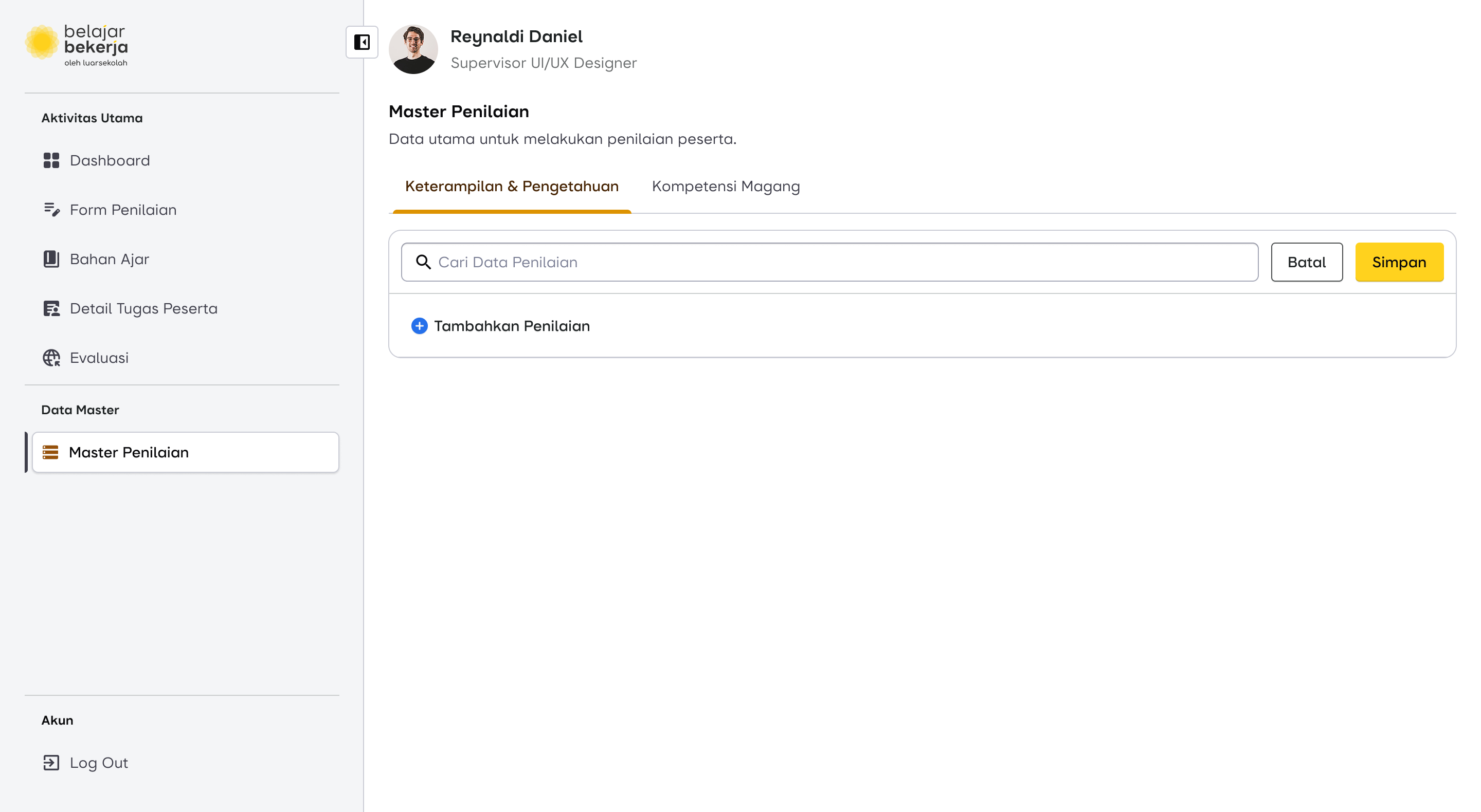
Design Proposal for Data Master
Scroll horizontally for more
To understand the impact of this master data flow change, it will be explained in the next case.
Second Case: Assessment Submission Flow
The Pain Point
As seen in the current evaluation flow, supervisors have to manually input assessments one by one for each user, making the process repetitive and time-consuming. This became a key focus area for improvement.
How Might We...
“Create an assessment for all users at once?”
I came up with an idea that could significantly improve the supervisor's experience, making the UX more user-friendly and reducing their workload.
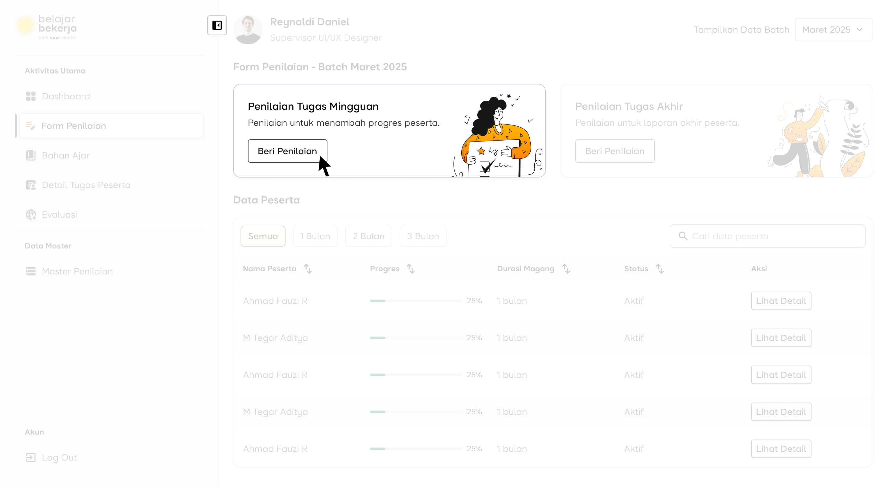
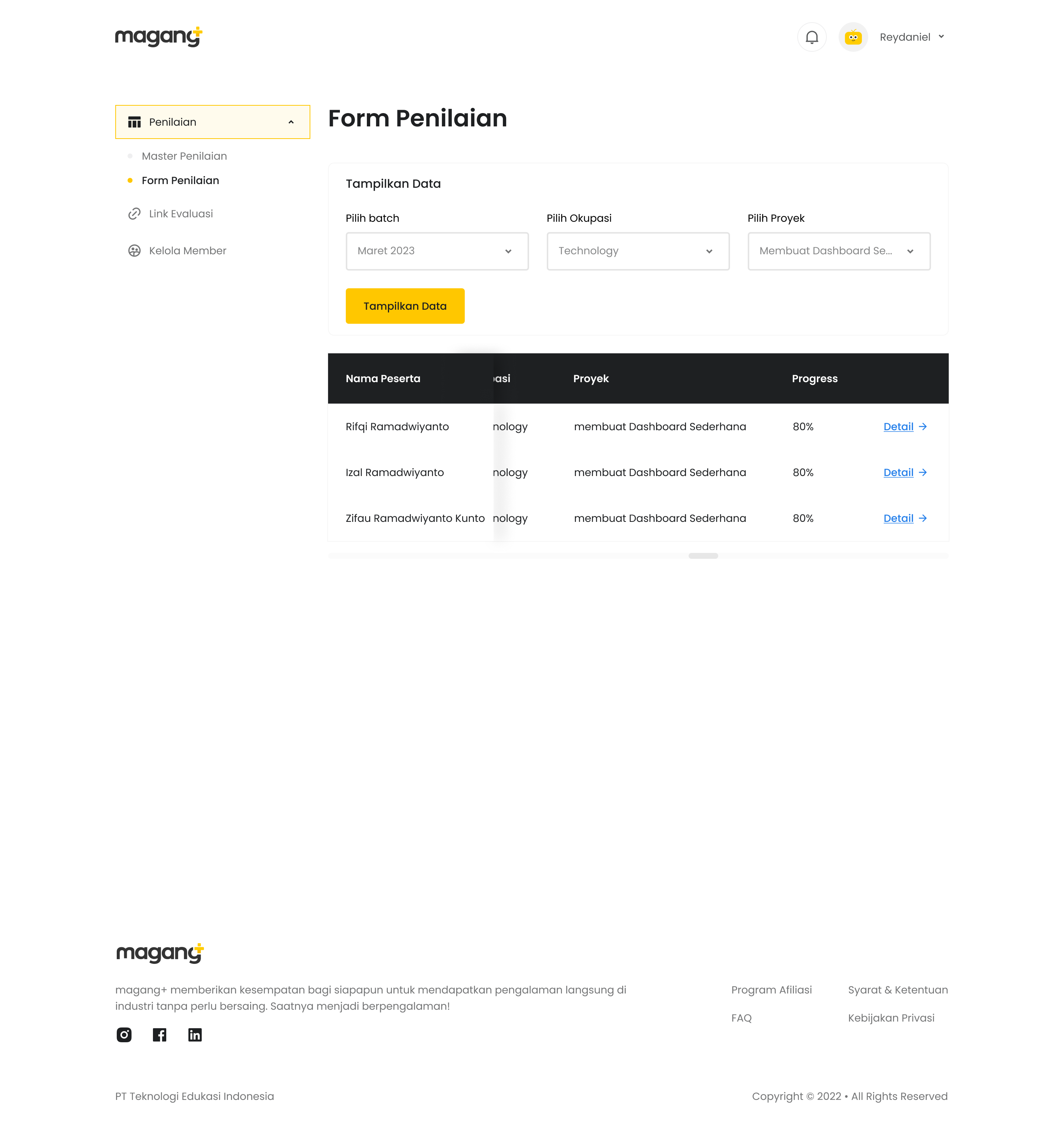
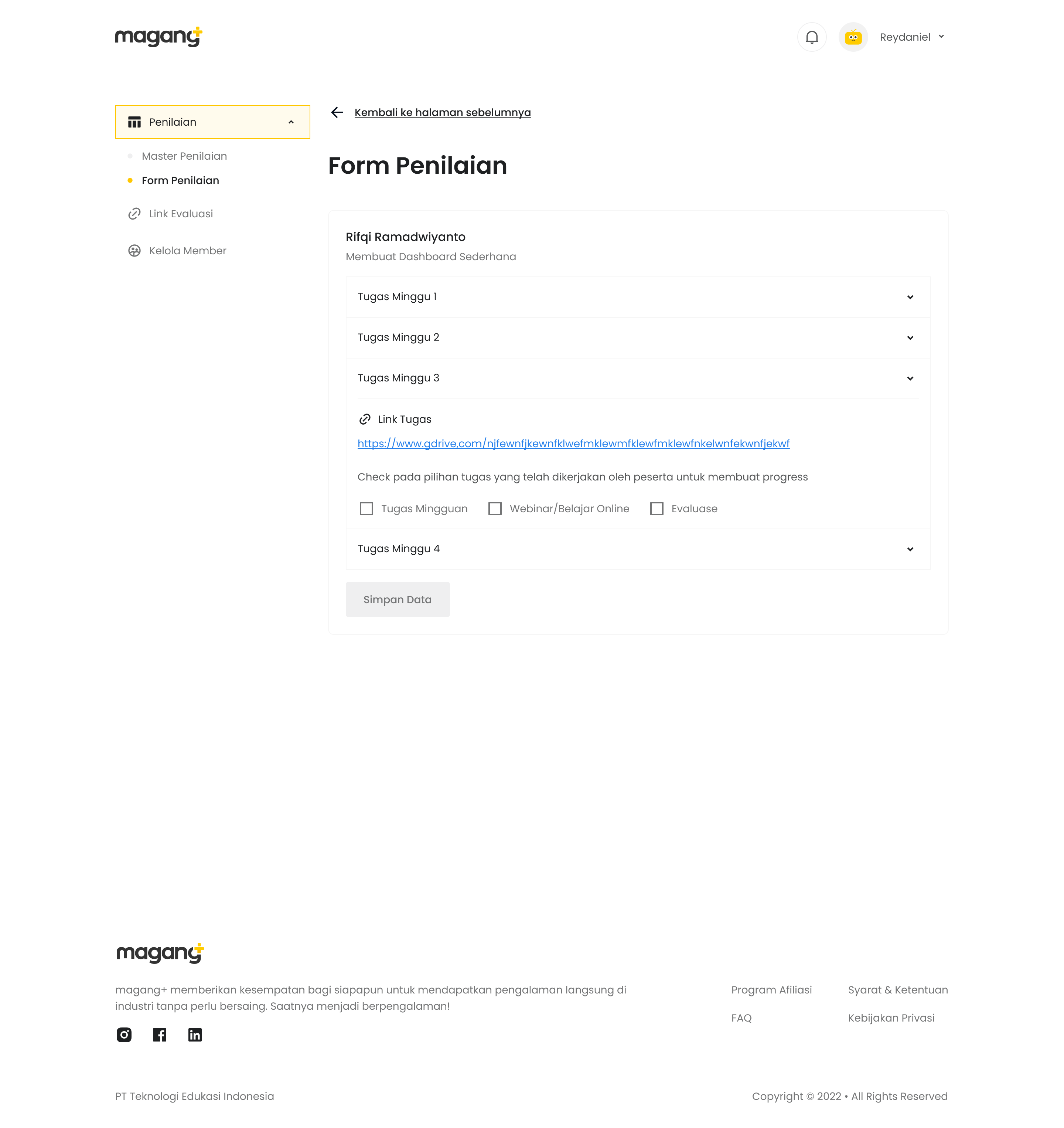
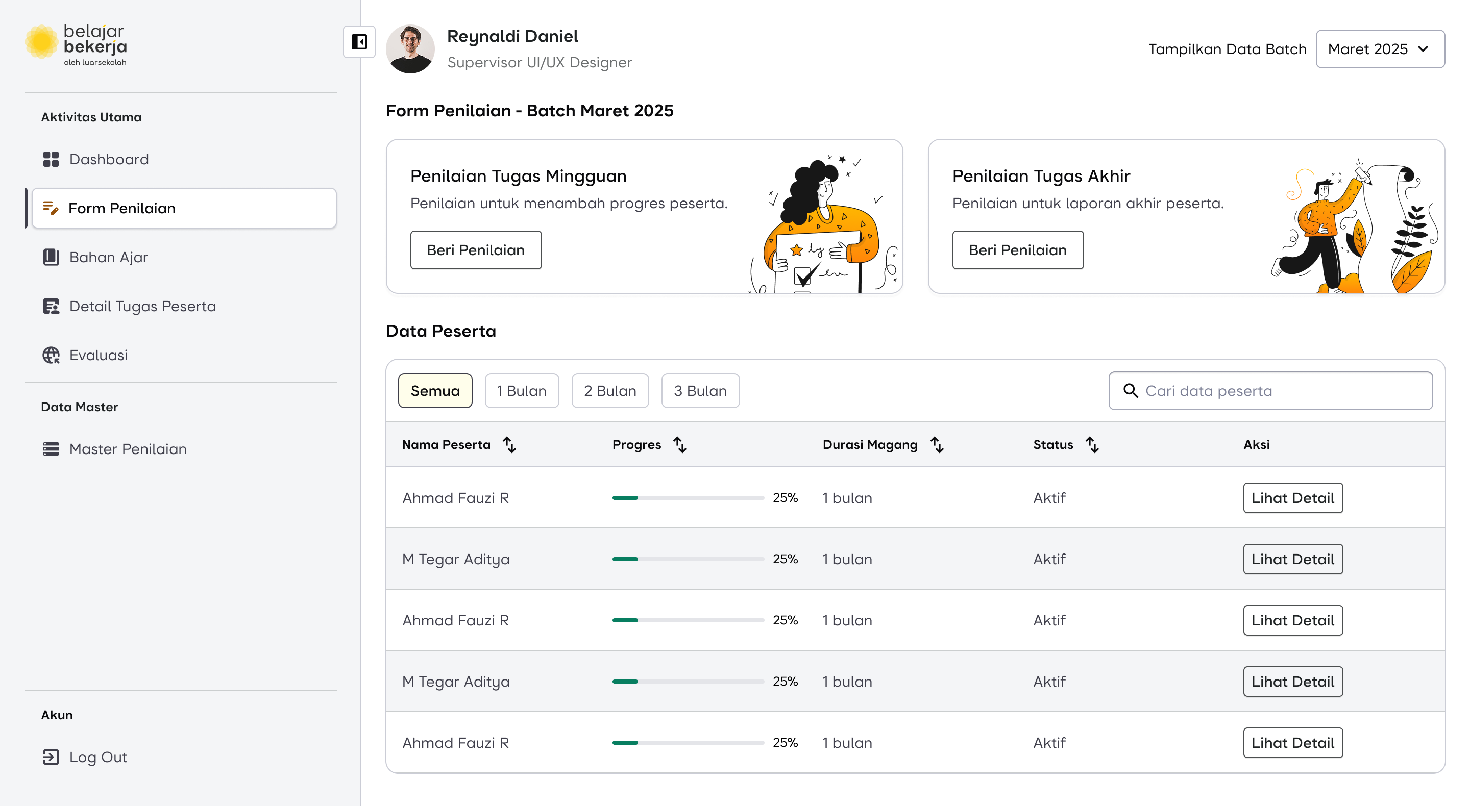
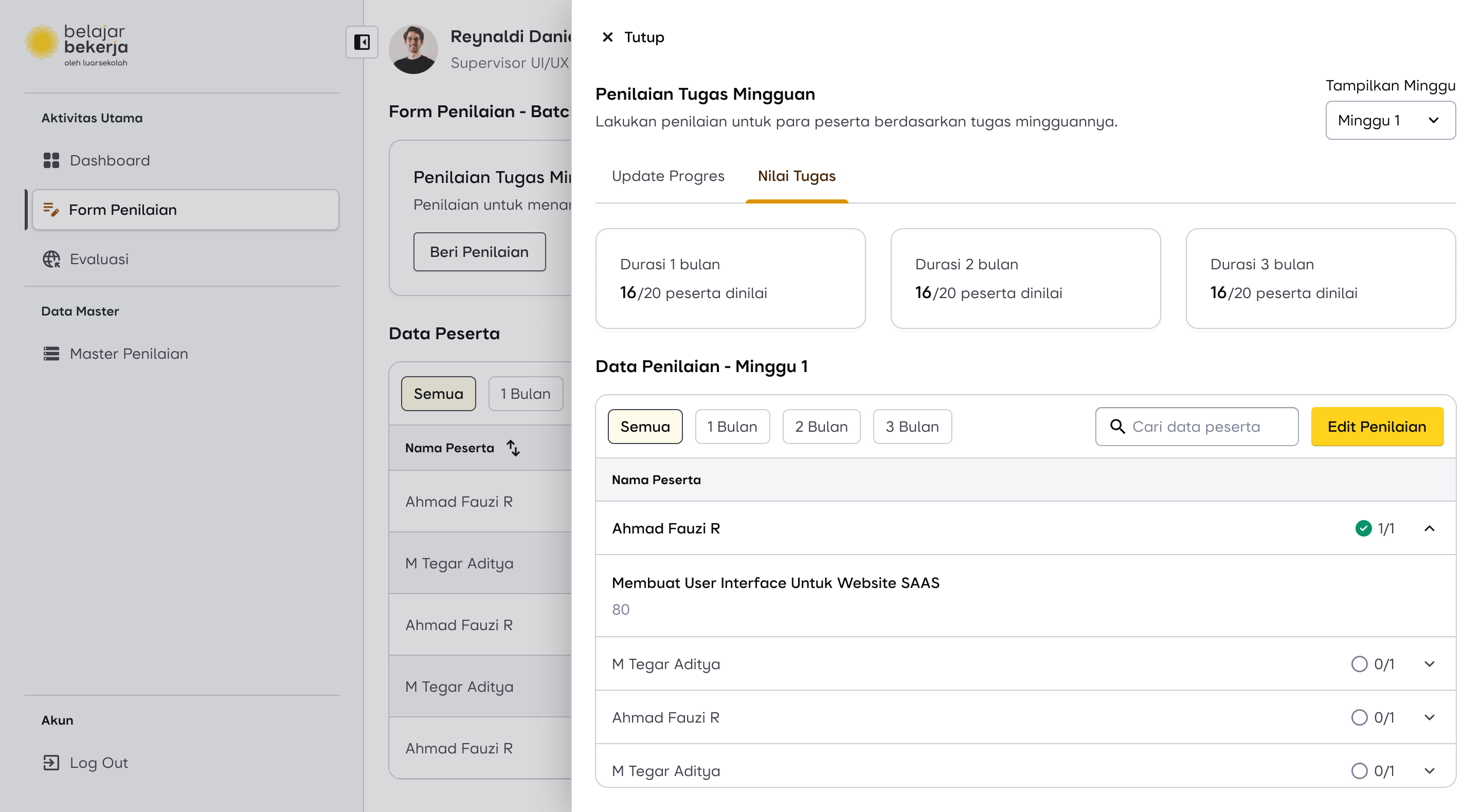
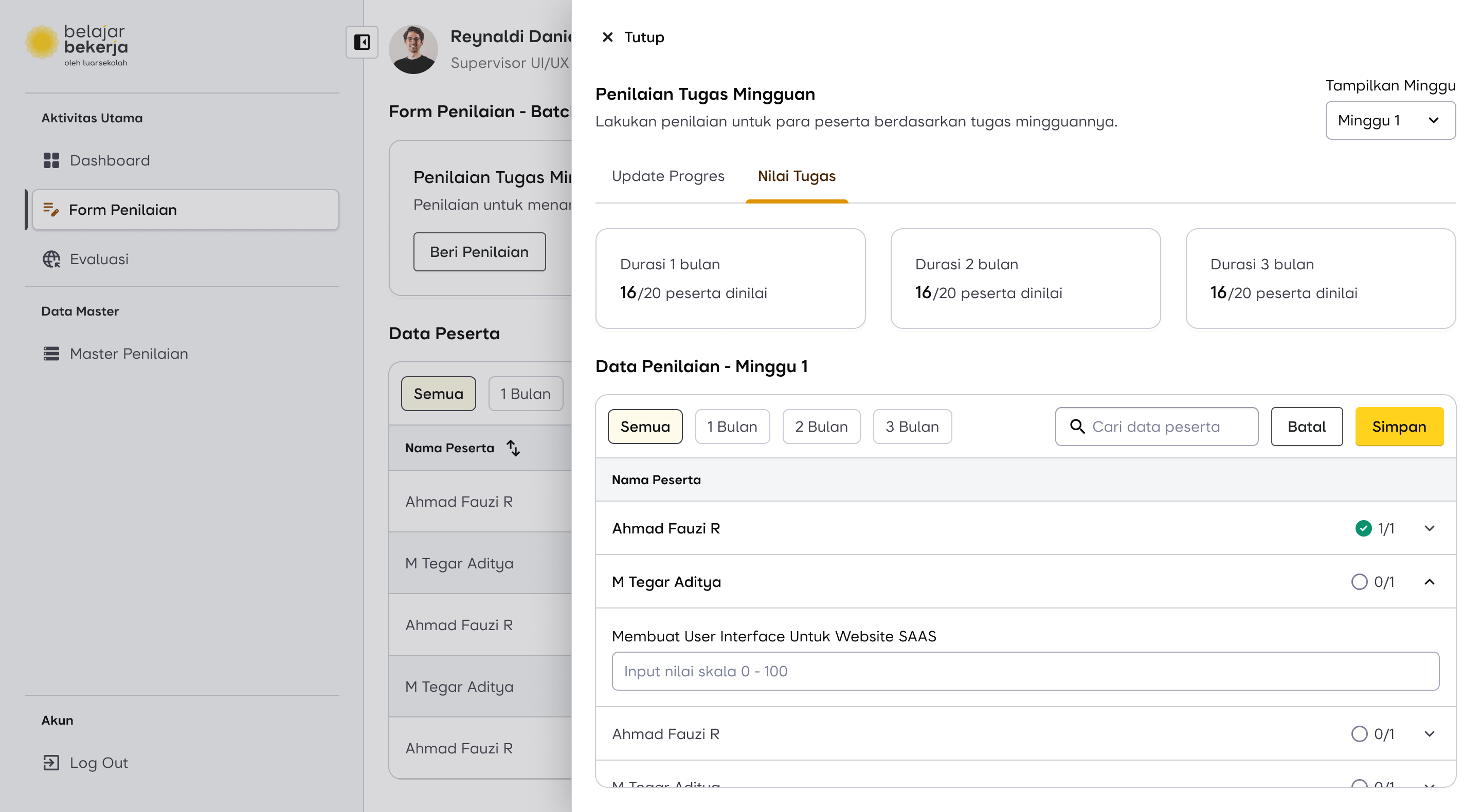
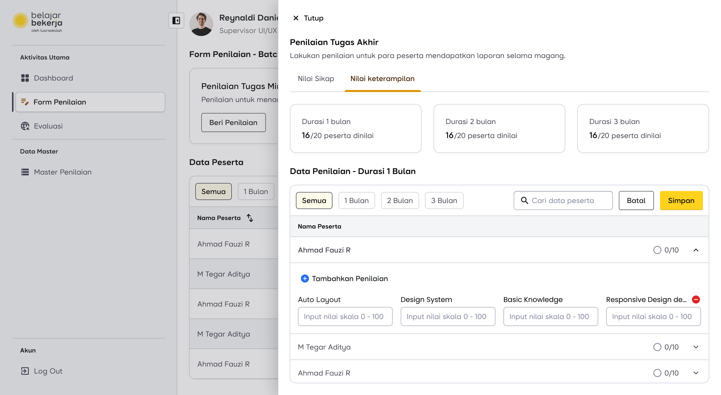
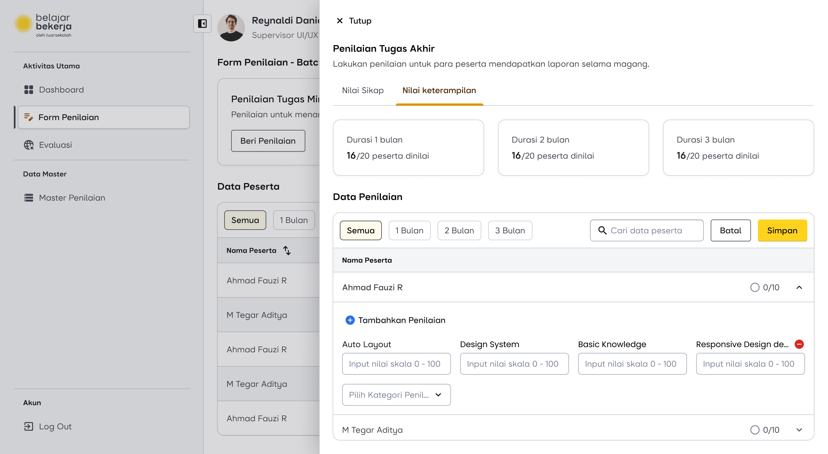
First, to prevent supervisors from constantly switching between users for weekly evaluations, I reversed the process. Instead of clicking on each user individually to assess them, supervisors can now select the "Weekly Task Evaluation" menu, where a list of users is already displayed. This allows them to complete evaluations directly, making the process much more seamless and efficient.
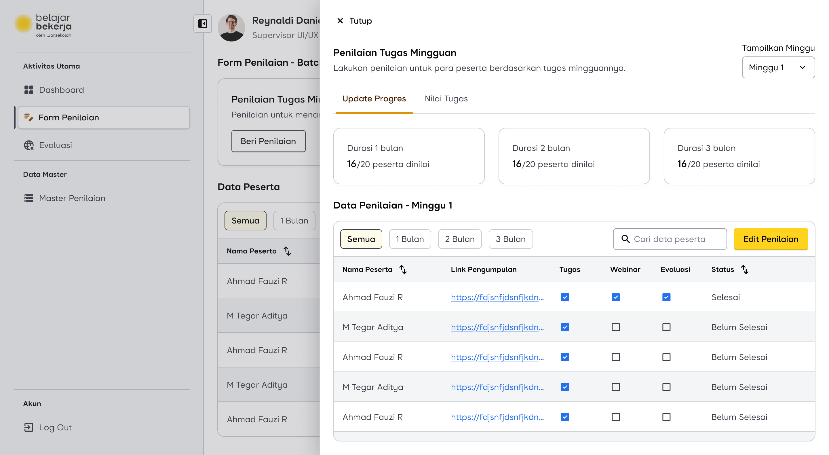
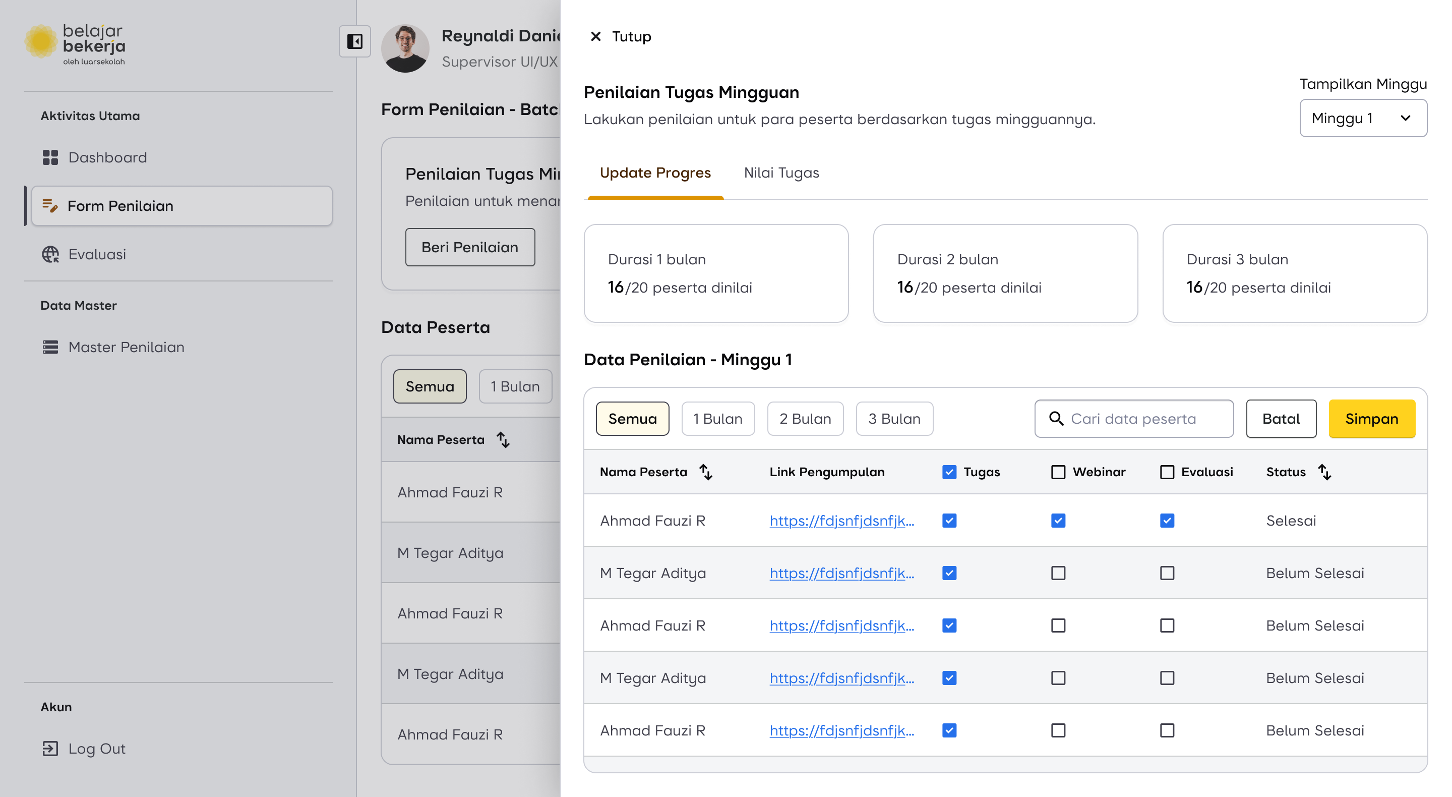
Then, I added a bulk evaluation feature, allowing supervisors to assess multiple users at once. This helps save time by enabling them to check off weekly task activities in bulk, reducing repetitive actions and streamlining the evaluation process.

But, What If?
The supervisor only wants to evaluate a specific user, for example, if they submitted their task late. Is it possible to assess that specific user directly?
Yes, it’s possible. The old flow is still retained to accommodate edge cases outside the normal flow. Supervisors can evaluate a specific user, but now with an improved feature for a better experience.
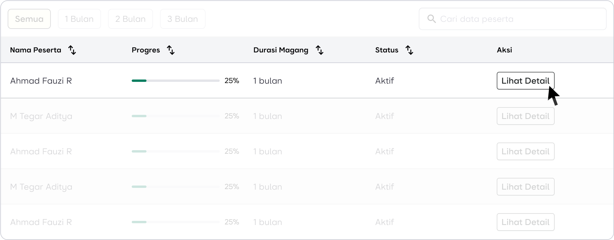
In each row, the following information is displayed:
- User Name
- Progress
- Internship Duration
- Status
- Action
Progress helps supervisors identify users with lower completion percentages compared to others. This could be due to unfinished task uploads or missed evaluations by the supervisor. With this feature, supervisors can easily focus on specific users who need attention by clicking the "Detail" button in the Actions column.
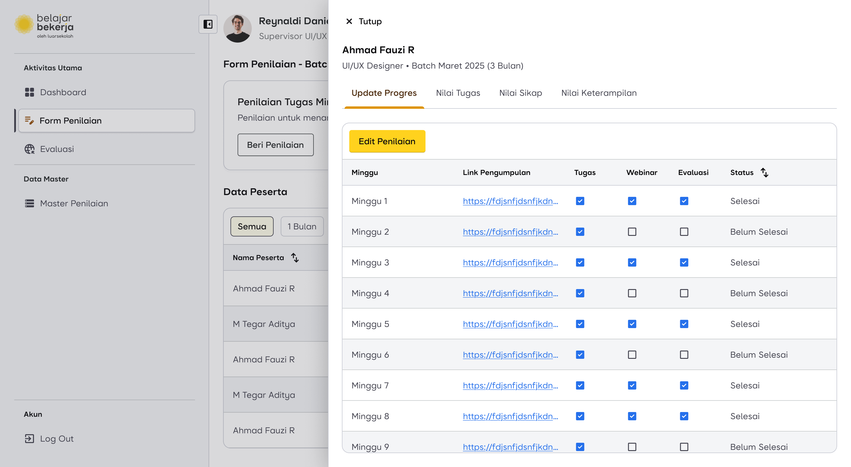
The evaluation mechanism remains the same, including the bulk evaluation feature. However, it's important to note that checklists can only be applied if the task has been uploaded. So, even when using bulk evaluation, any tasks that haven't been uploaded will not be checked automatically.
In addition to weekly evaluations, supervisors can also access other types of evaluations within the system.
Design Proposal for Weekly Assessment Flow
Scroll horizontally for more
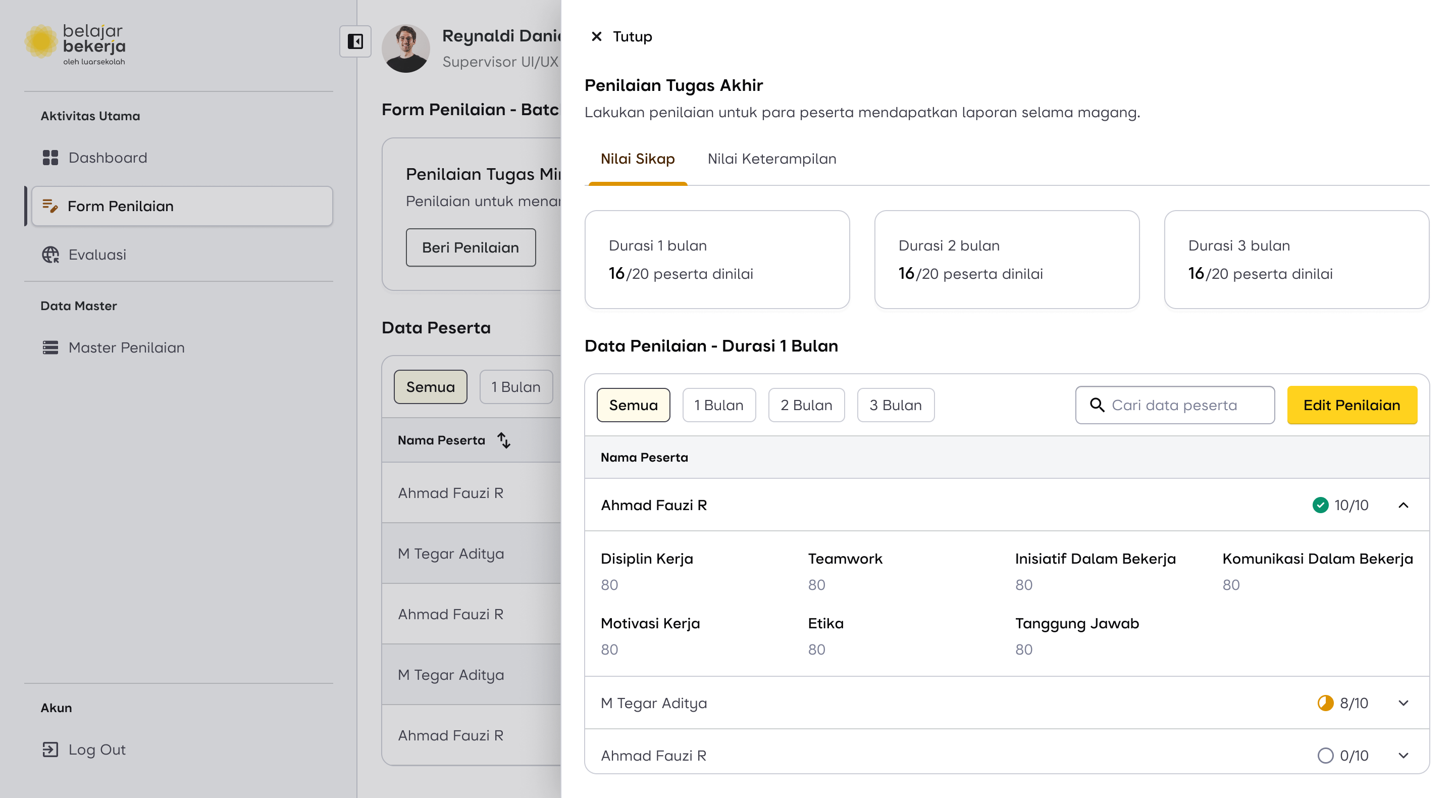
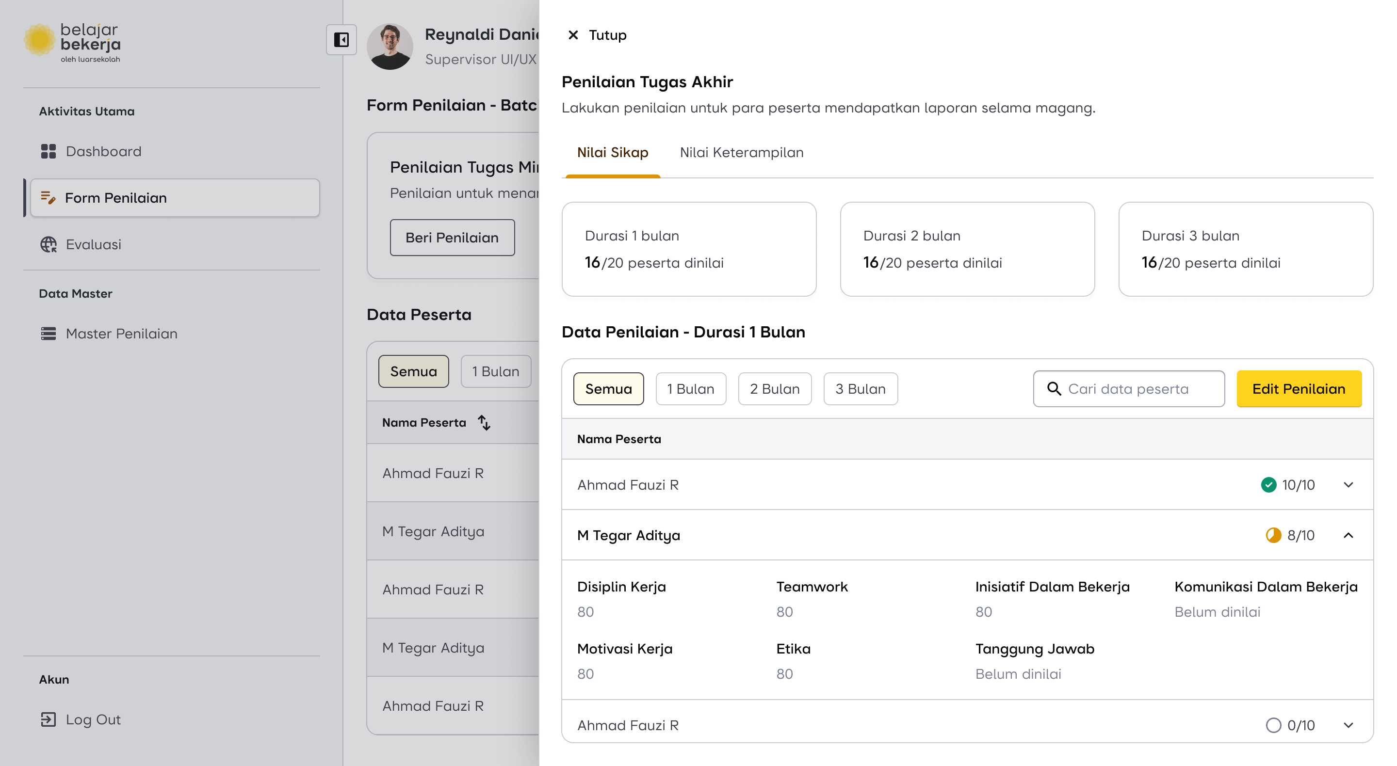
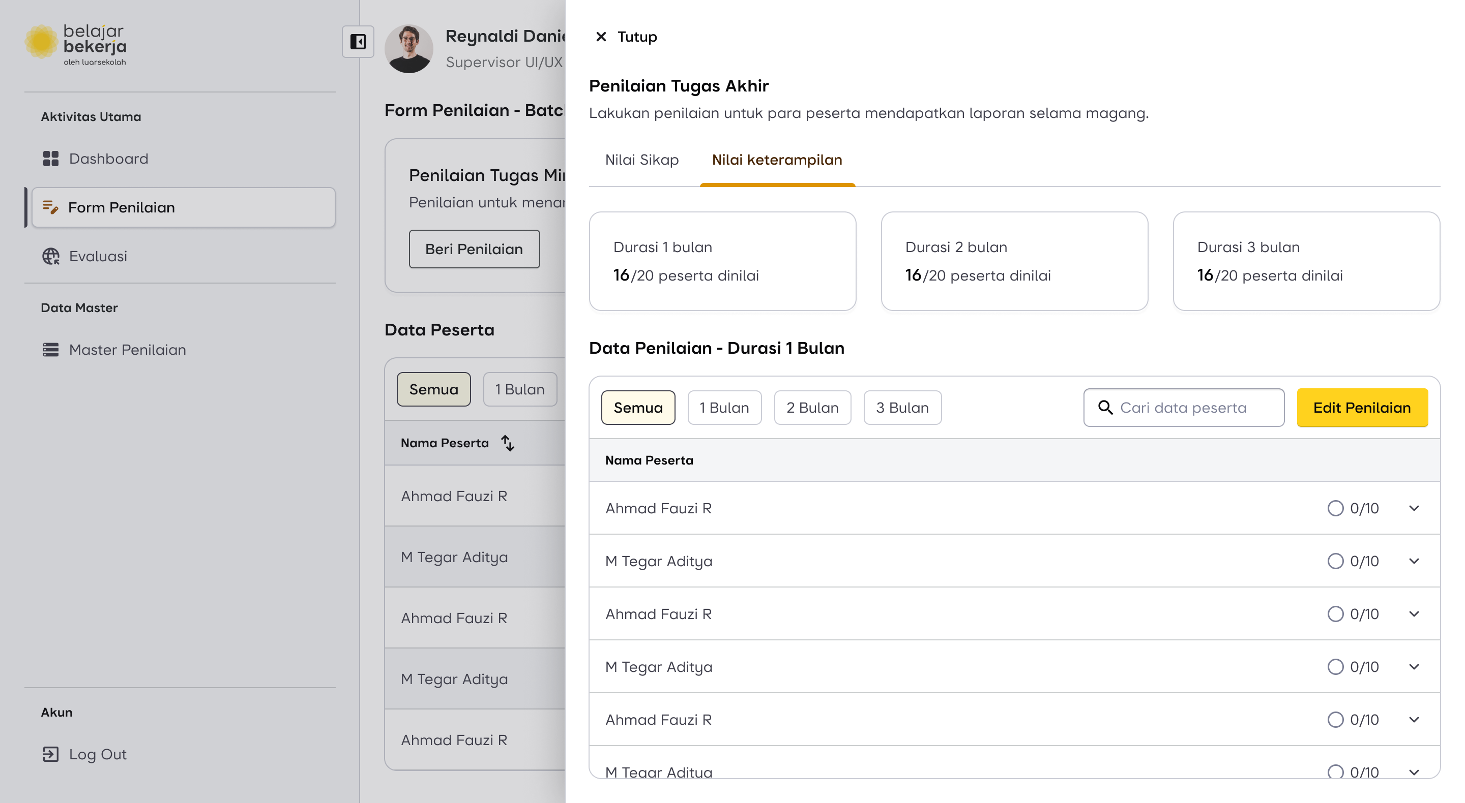
Final Assessment Flow
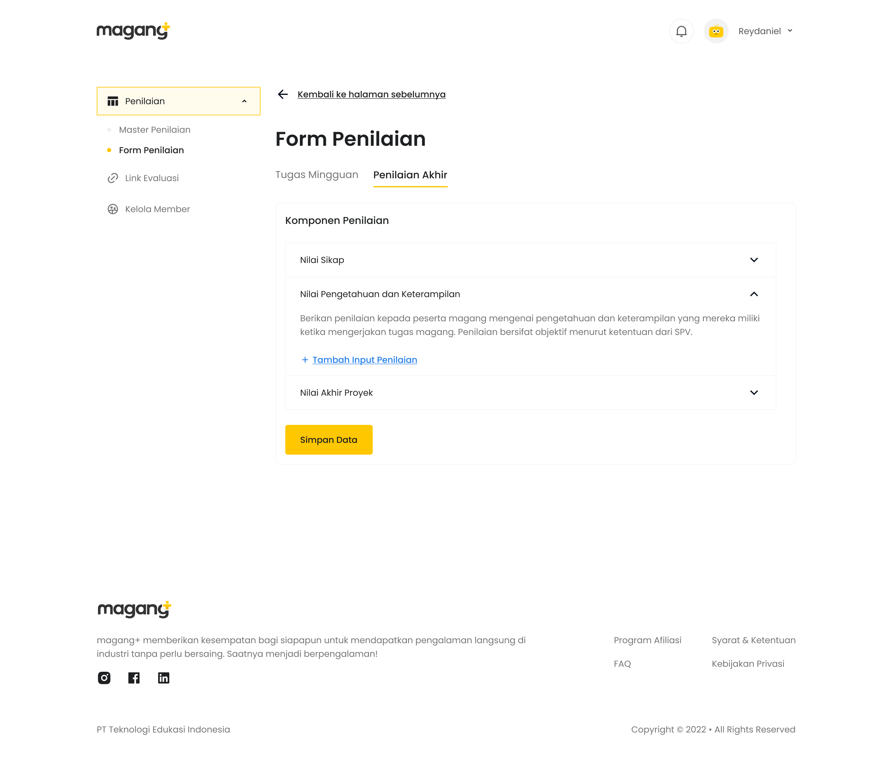
Now, for the final evaluation, supervisors are required to assess users based on the following criteria:
- Attitude
- Skills and Knowledge
- Final Project
The Pain Point
As previously mentioned, in this flow—especially when evaluating Skills & Knowledge—supervisors found the process repetitive and exhausting because they had to manually add evaluation criteria for each user, even though these criteria were already inputted in the master data.
How Might We...
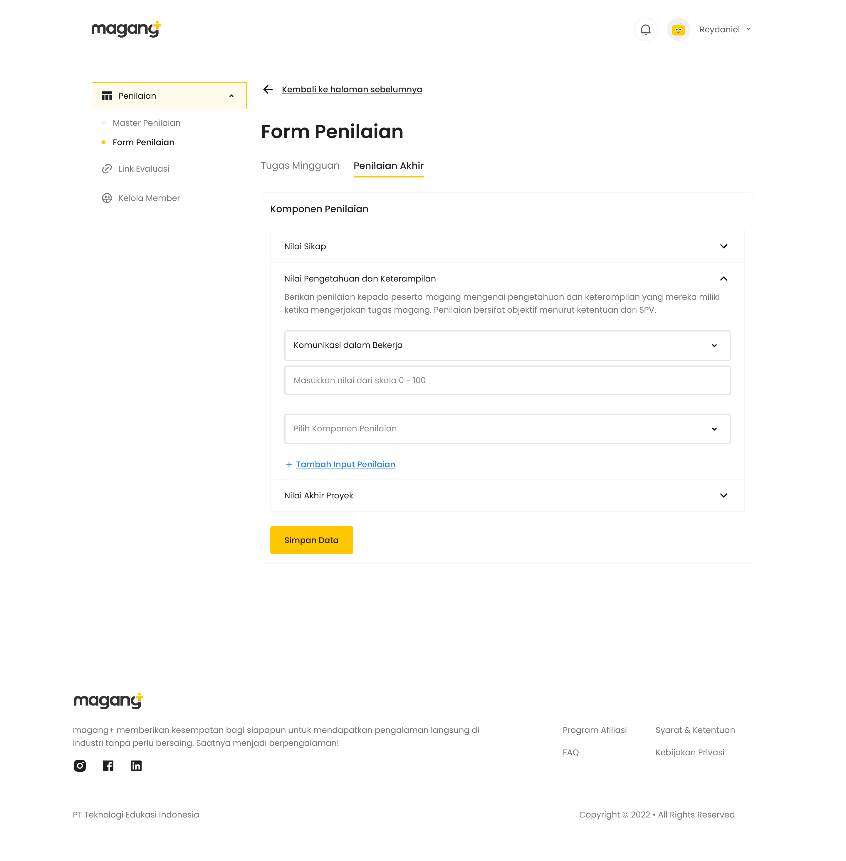
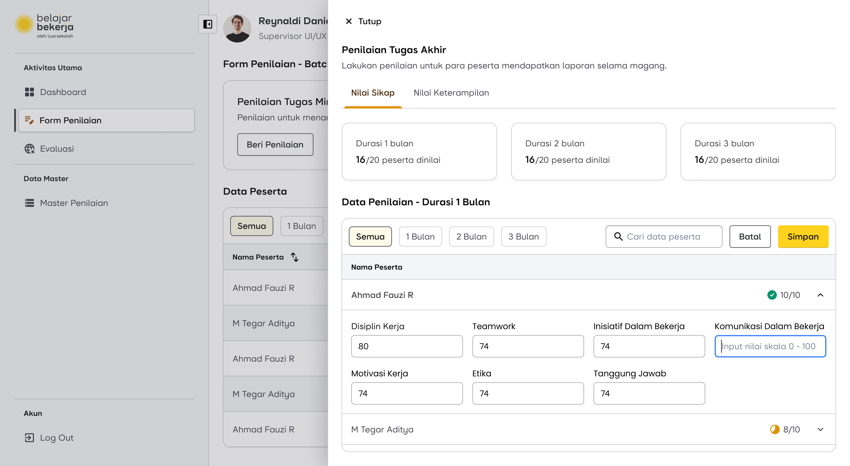
“Make a feature to flag assessment as a mandatory or optional?”
This feature has already been implemented in the master data. This is why I modified the master data flow—to make it easier for supervisors to assess Skills & Knowledge.
Here is the impact of adding the "Mandatory or Optional" data in the master data on the evaluation process.
Previously, supervisors had to manually input each evaluation criterion one by one.
Now, supervisors only need to fill in the evaluation data already marked as "Mandatory". If they believe a user deserves additional assessments, they can simply click "Add Evaluation", and a new field will appear, allowing them to select the criteria directly from the master data database.
The difference between Mandatory and Optional fields is that Optional fields can be removed, indicated by a remove icon on the label.
With this change, I am confident that it will help supervisors perform their tasks more efficiently when using the newly improved dashboard.
Design Proposal for Final Assessment Flow
Scroll horizontally for more
Impact and Outcome
The design has been delivered to the development team and is currently under development. I will provide updates once it has been implemented and used by the supervisors.
Lesson Learned
I’ve learned that solving user problems isn't just about addressing what’s on the surface or what users explicitly say. Instead, it's important to dig deeper—there might be hidden opportunities that can create a much bigger impact beyond just fixing the immediate pain points.